Lead UX Designer / Design Director
TELUS Digital · Western Union E1 Wallet · Melbourne, AU
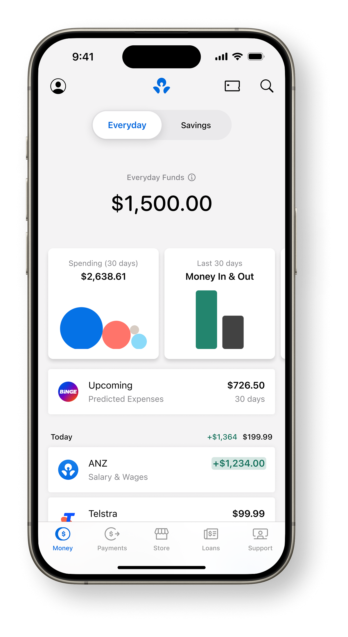
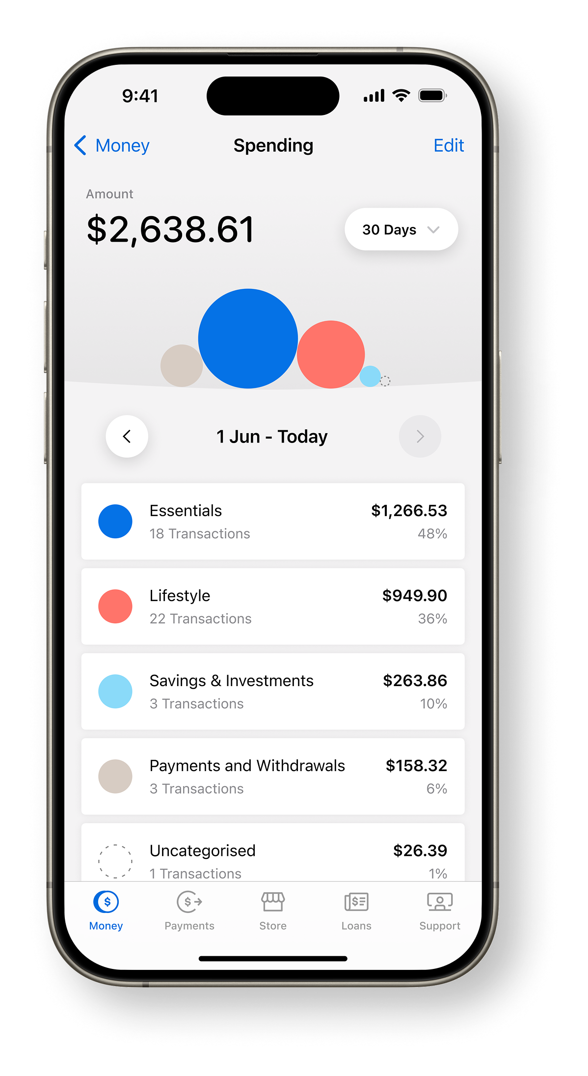
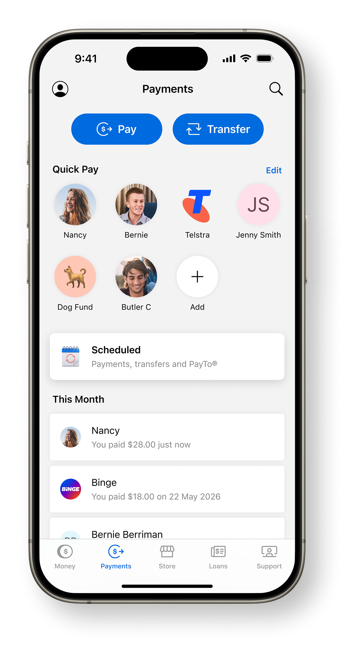
- Leading UX design for the E1 Wallet — a next-generation multicurrency digital wallet.
- Driving a cross-market design audit across AU and MX.
Every token and component actually shipping on leroice.com, pulled live from
global.css. Tweak a class there and it updates here and on the real
pages at once — this page has no styles of its own beyond its own scaffolding.
Four tokens, light + dark. No other colours exist in the system.
--op-primary — 1
--op-secondary — 0.8
--op-tertiary — 0.7
--op-subtle — 0.5
Geist, three weights. Tracking sits at −0.43px everywhere.
Geist Regular (400) — Leigh Scholten
Geist Medium (450) — Leigh Scholten
Geist SemiBold (600) — Leigh Scholten
| Token | Value | Use |
|---|---|---|
--page-max | 76rem | Max content width, every page |
--list-width | 22rem | Home list column width |
--col-gap | 6rem | Home split column gap |
--side-pad | 2rem | Outer page padding |
--content-pad | side-pad + sp-base | Text alignment inset (matches nav brand) |
--nav-height | 7rem (6rem <880px) | Sticky offset for detail subnav |
One rule sites-wide: nothing appears or vanishes instantly. Pure opacity + blur for
reveals (no transform, so layout measurements stay stable for FLIP); named easings
and spring physics live in arc-flip.ts.
| System | Values | Used by |
|---|---|---|
Spring (pill / arc-flip) | stiffness 410 · damping 84 · mass 3 | Rollover pill, arcFlip default spring |
Reveal — load cascade | 520ms in, 60ms step, 40ms base delay | revealOnLoad(), top-down |
Reveal — proximity out | 380ms out / 480ms in, 45ms step | staggerOut / staggerIn, ripples from trigger |
Page exit | 260ms, capped 160ms total spread | pageExit() before navigation |
Subnav elastic entrance | 1409.864ms, one-shot | subnav-elastic.ts — back badge → title → subtitle → credits |
Blur (reveal hidden state) | 6px | Every [data-reveal] / [data-elastic] hidden state |
The homepage's rollover pill is driven by an rAF spring loop tied to live pointer
tracking, inline in index.astro — not extracted to a shared module, so
it isn't reproduced here. Static reference only; see the
homepage for the interactive version.
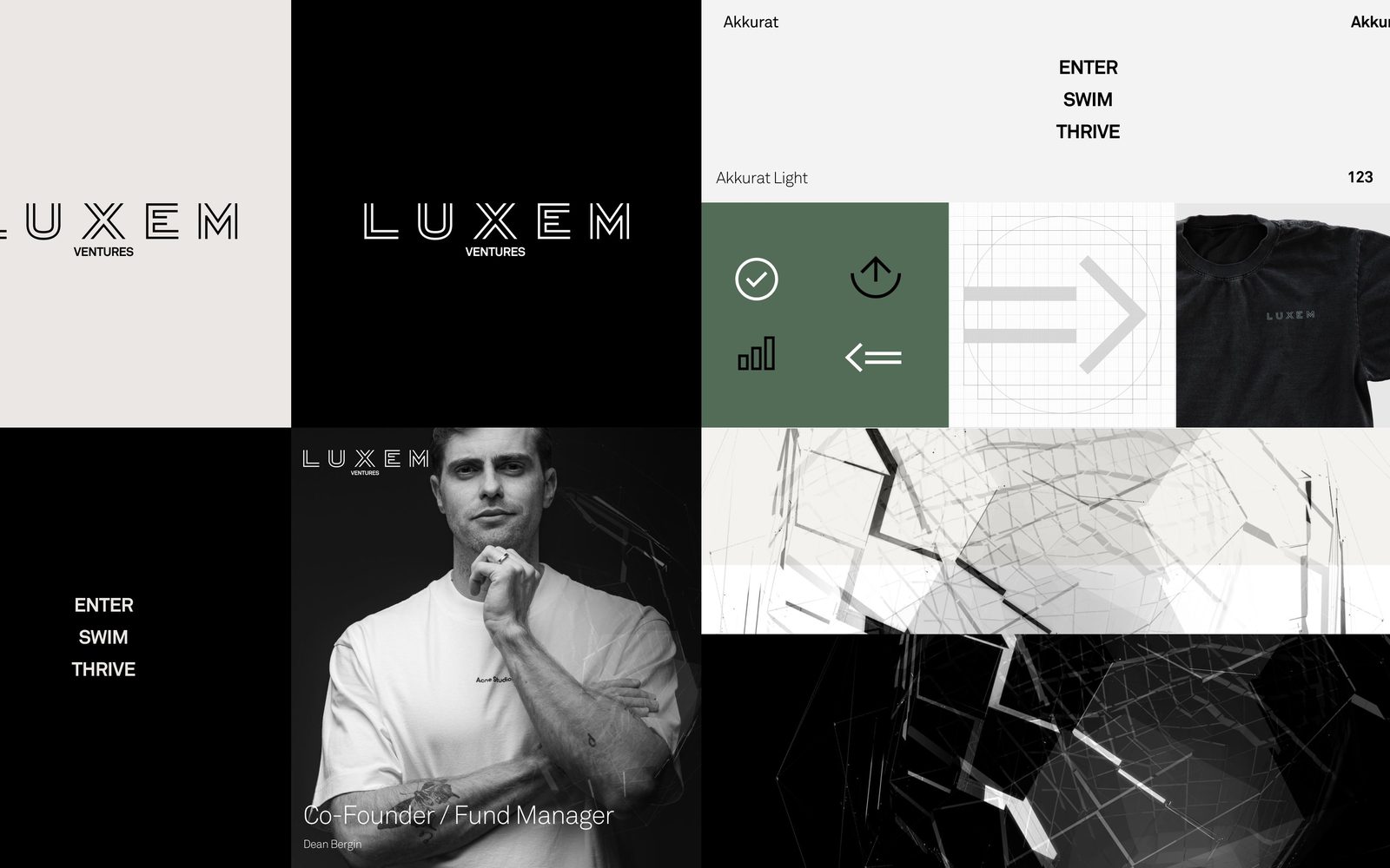
Gated case studies (Figma: Nav-Item states + unlock set). A locked row carries a
padlock; hovering swaps it for the "Unlock on request" pill (fade-from-blur);
clicking opens the code-entry dialog. A correct code holds for the session.
Set locked: true + lockHash (SHA-256 of the code) in
the project's frontmatter.
demo)
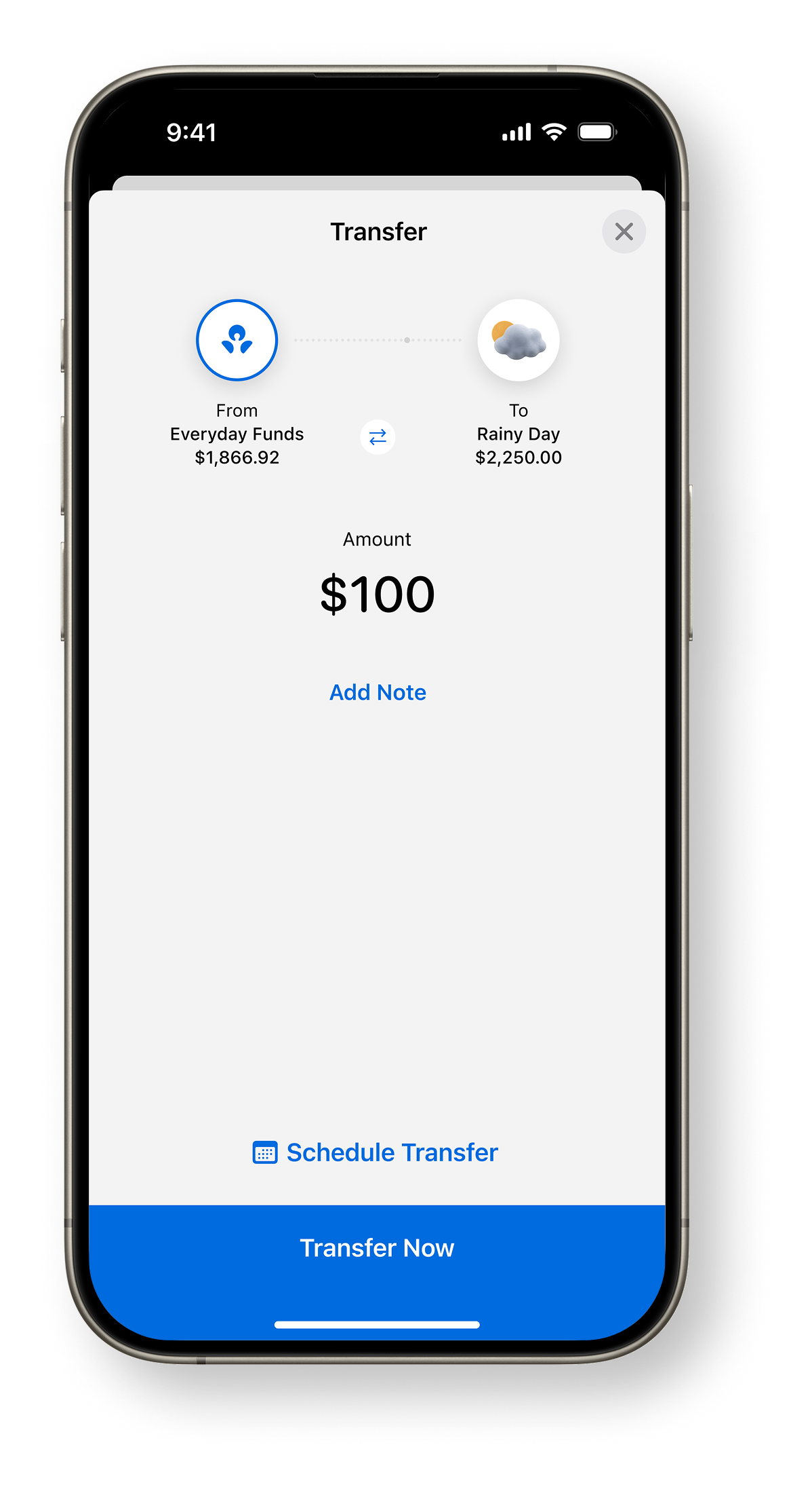
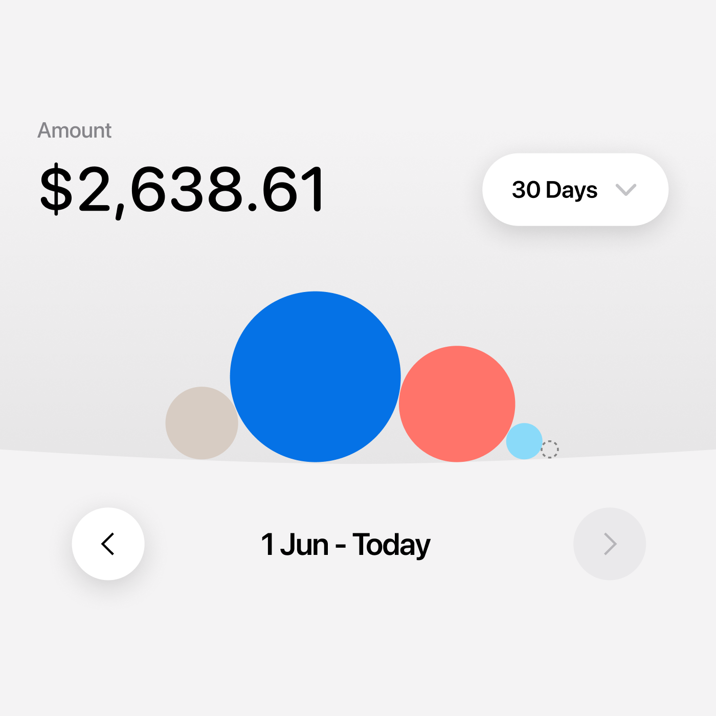
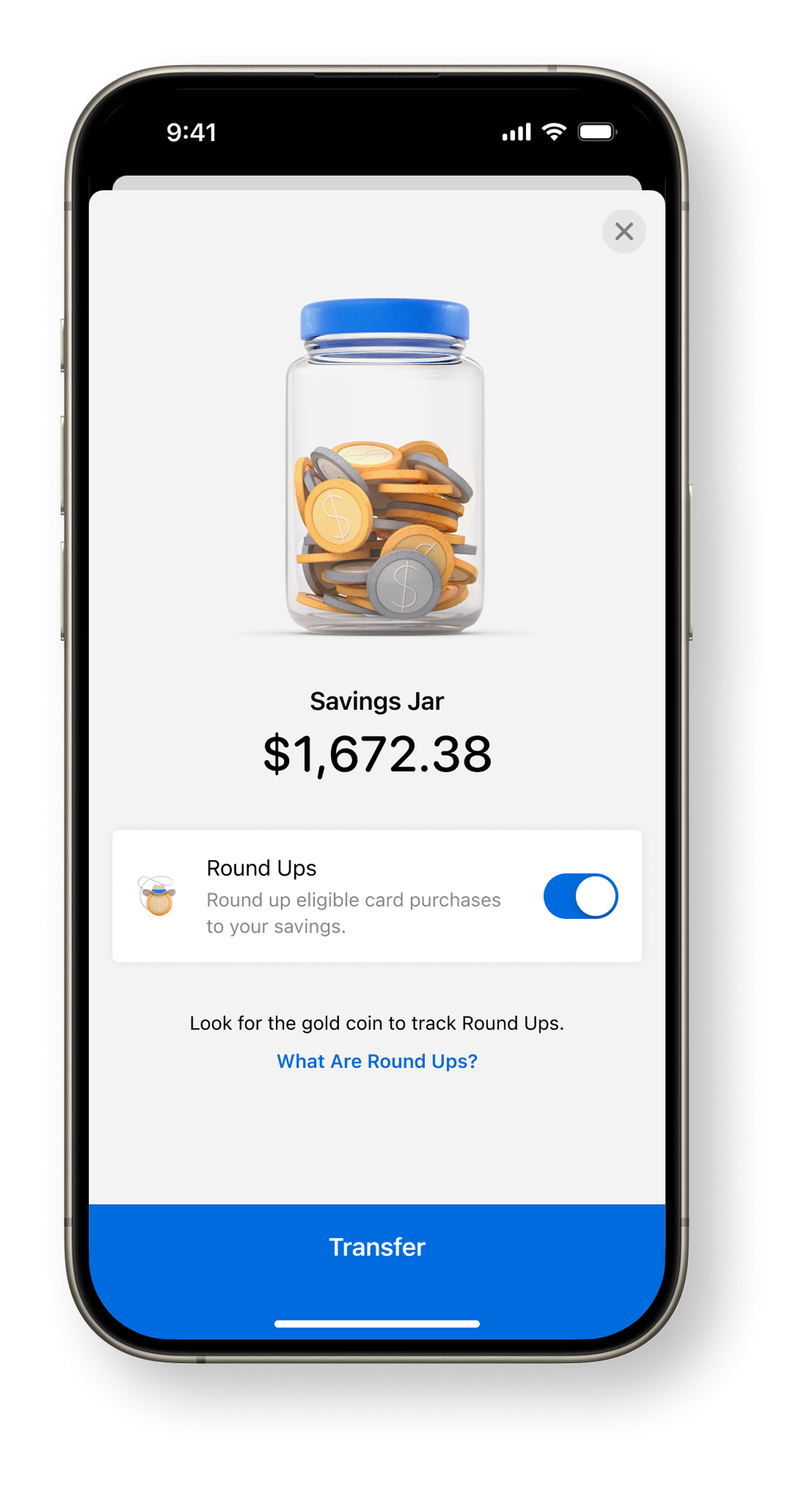
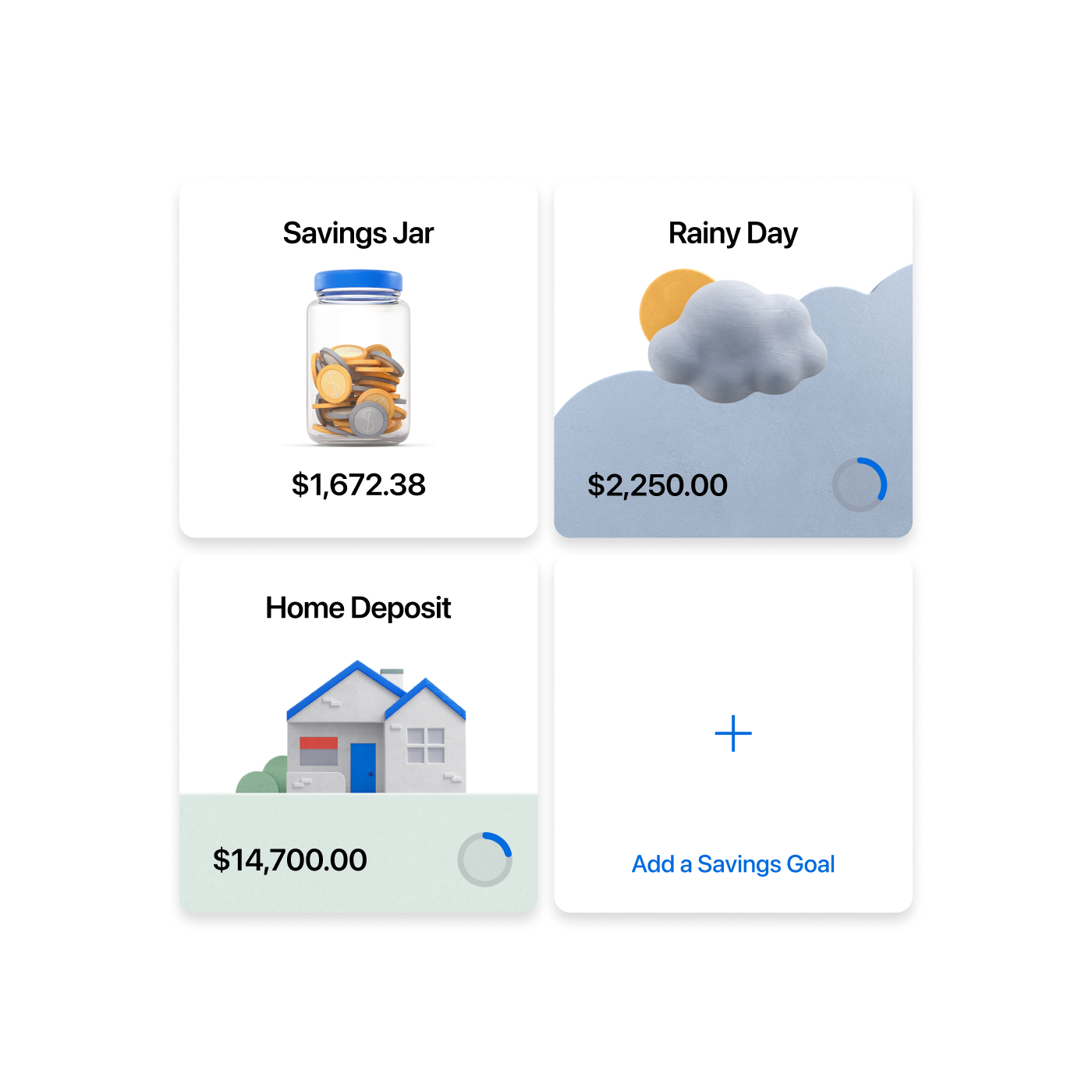
Raw HTML blocks dropped into a project's markdown body — cs-mocks,
cs-3, cs-2, cs-rows. Each breaks out of the
2/3 prose column to the full content width.
TELUS Digital · Western Union E1 Wallet · Melbourne, AU
profile
Every CV section uses this two-column rail: a lowercase label on the left, content on the right. Collapses to a stacked heading under 880px.
There's no distinct button component on the site — every interactive element is a text link with an opacity transition on hover (soft/strong → full).