
More detail to come. The work is in flight and partially under wraps until App Store launch.
In the meantime, the headline: a multicurrency wallet for the AU market, designed within (and stress-testing) Western Union’s global design system. I’m leading the design authority role across product, system contribution, and stakeholder alignment with the AU creative and product leadership.
What I’m responsible for
I lead the design at the program level — direction, system contribution, and the connective tissue between AU executive stakeholders, the global product team, and the engineering org. The design audit I ran across 34 flows and 360 screens earlier in the program now anchors the system-level decisions that the rest of the work pulls from.
Why it’s interesting
Most multicurrency wallets either look like banking apps or look like crypto apps. Neither model fits a remittance-first audience. The interesting design problem is how the wallet feels familiar enough to trust with money, and lightweight enough not to feel like a bank.
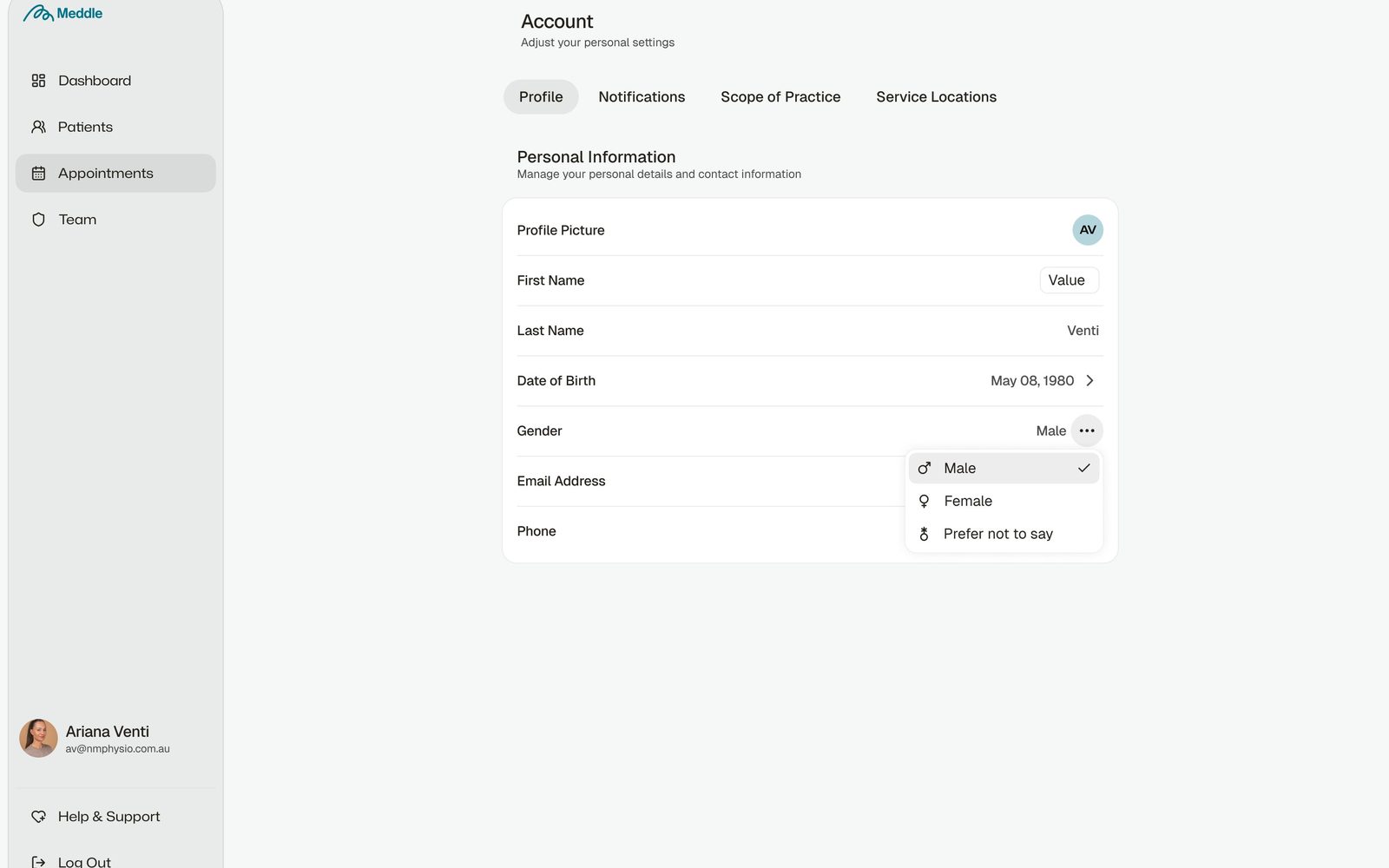
Meddle is an intelligent operating system for healthcare. I led design across brand and product foundations — defining the visual language, building the design system, and shaping how the product behaves at the surface and the structural levels.
Scope
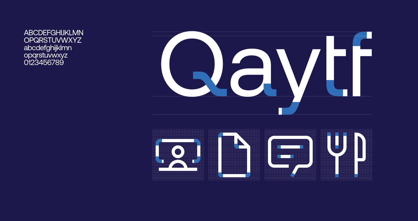
The work spans brand identity through to the underlying technical foundations. The visual language is built around the Meddle wordmark, a dark-first colour system, and Mona Sans VF as the typographic core. The brand reads as confident and clinical without feeling sterile.
The design system was built from a W3C DTCG token architecture (colour, spacing, border radius, typography) into Figma Variables, then into a fourteen-file TypeScript React component library with Code Connect mappings to keep the design and code surfaces in lockstep.
Why it works
A healthcare OS has to feel calm under load — clinicians and operators are bringing real-world pressure to the screen, and the product needs to absorb that rather than add to it. The system bias is toward generous spacing, restrained motion, and information hierarchy that doesn’t demand interpretation. Tokens carry the decisions so any team building on Meddle inherits the calm by default.
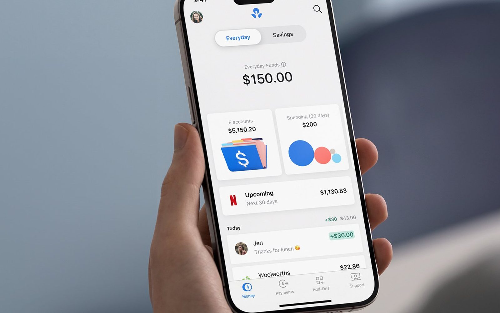
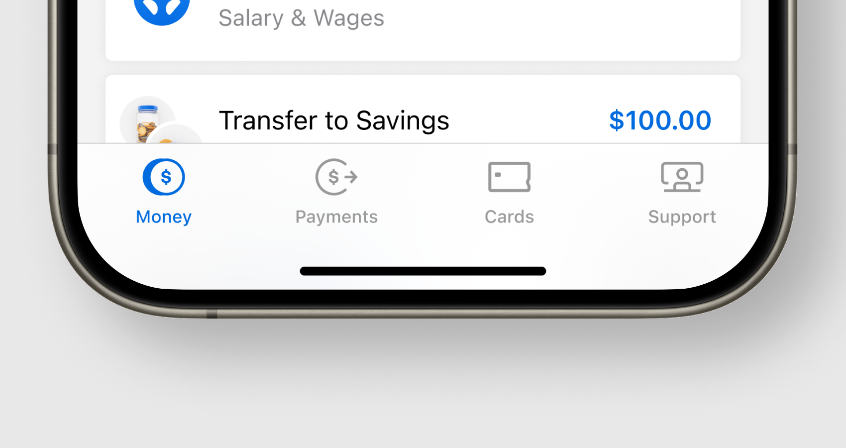
The chance to build a bank from scratch within a major incumbent is rare; ANZ Plus was that opportunity.
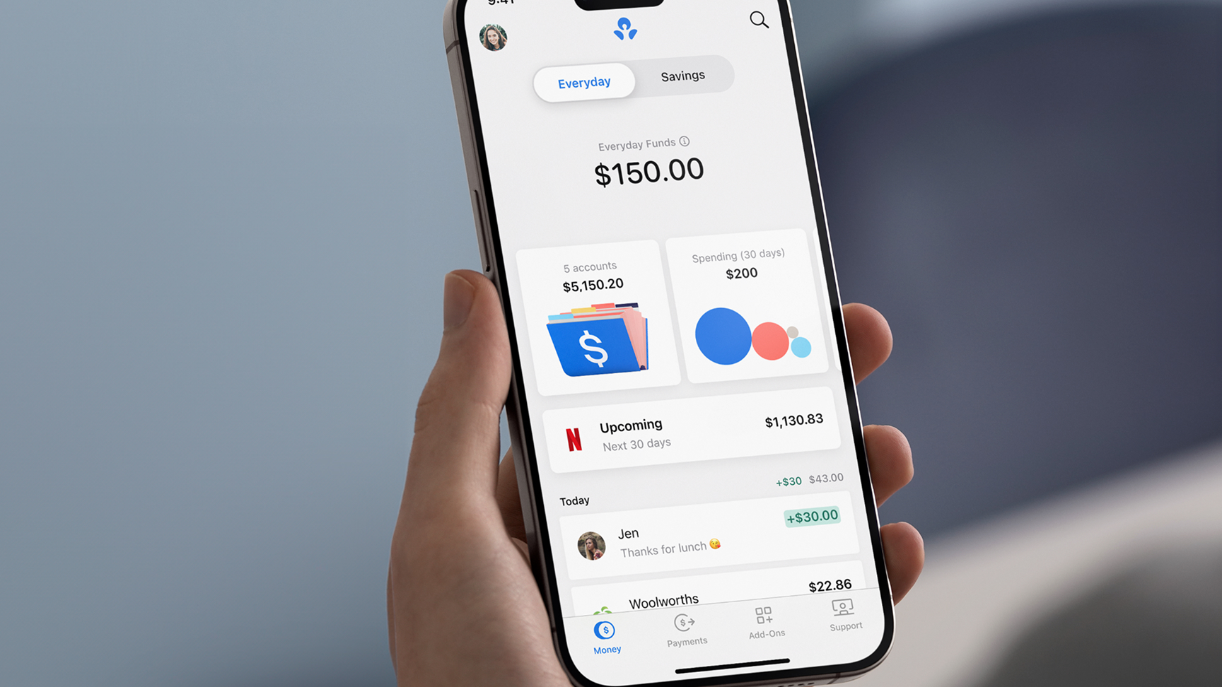
With a bold mission to create a substantially better bank, and armed with a foundational set of principles to help people with their financial wellbeing, we integrated scalable cloud platforms (GCP) and modern CX tools (Salesforce) into a best-in-class, mobile-first experience.
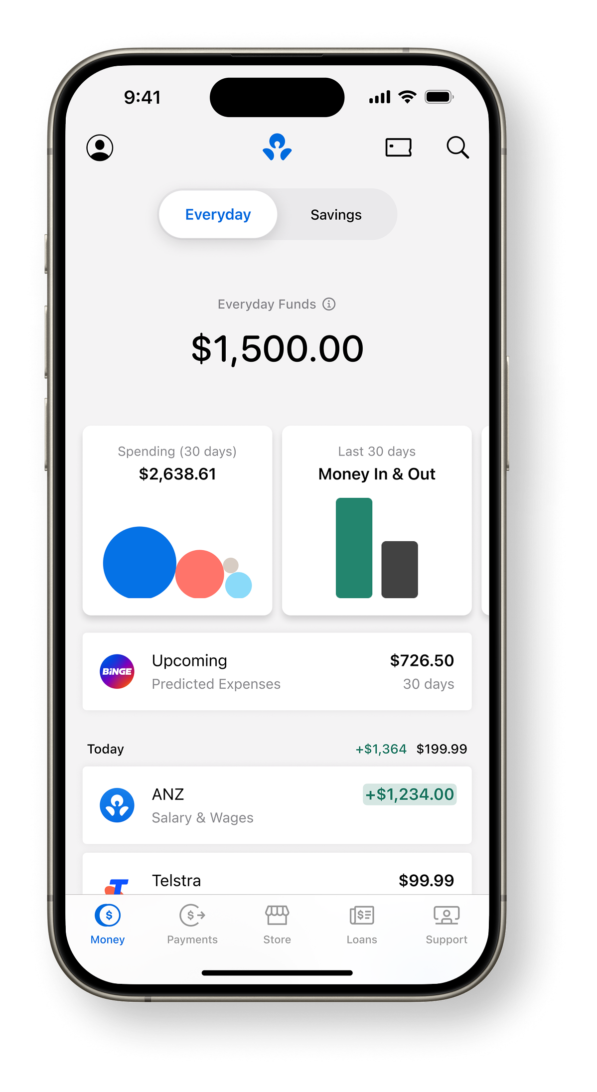
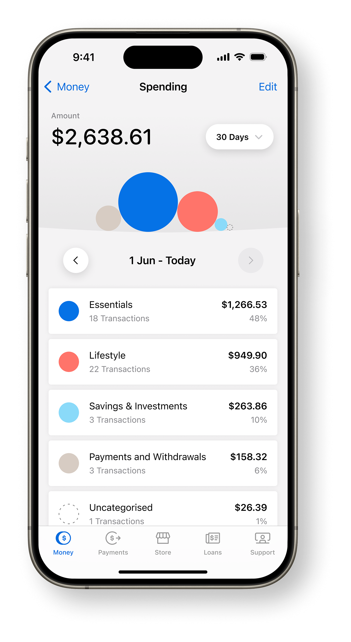
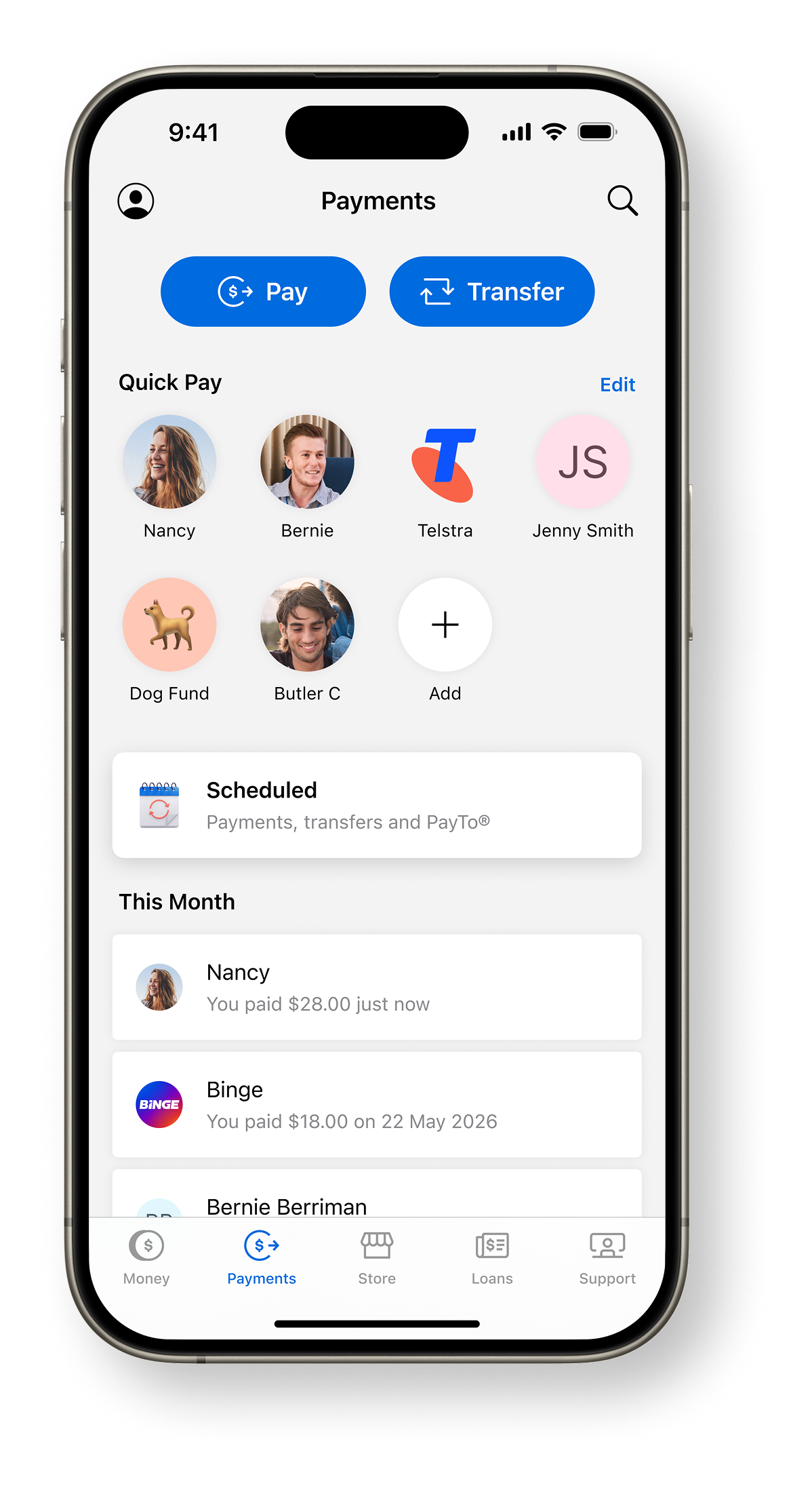
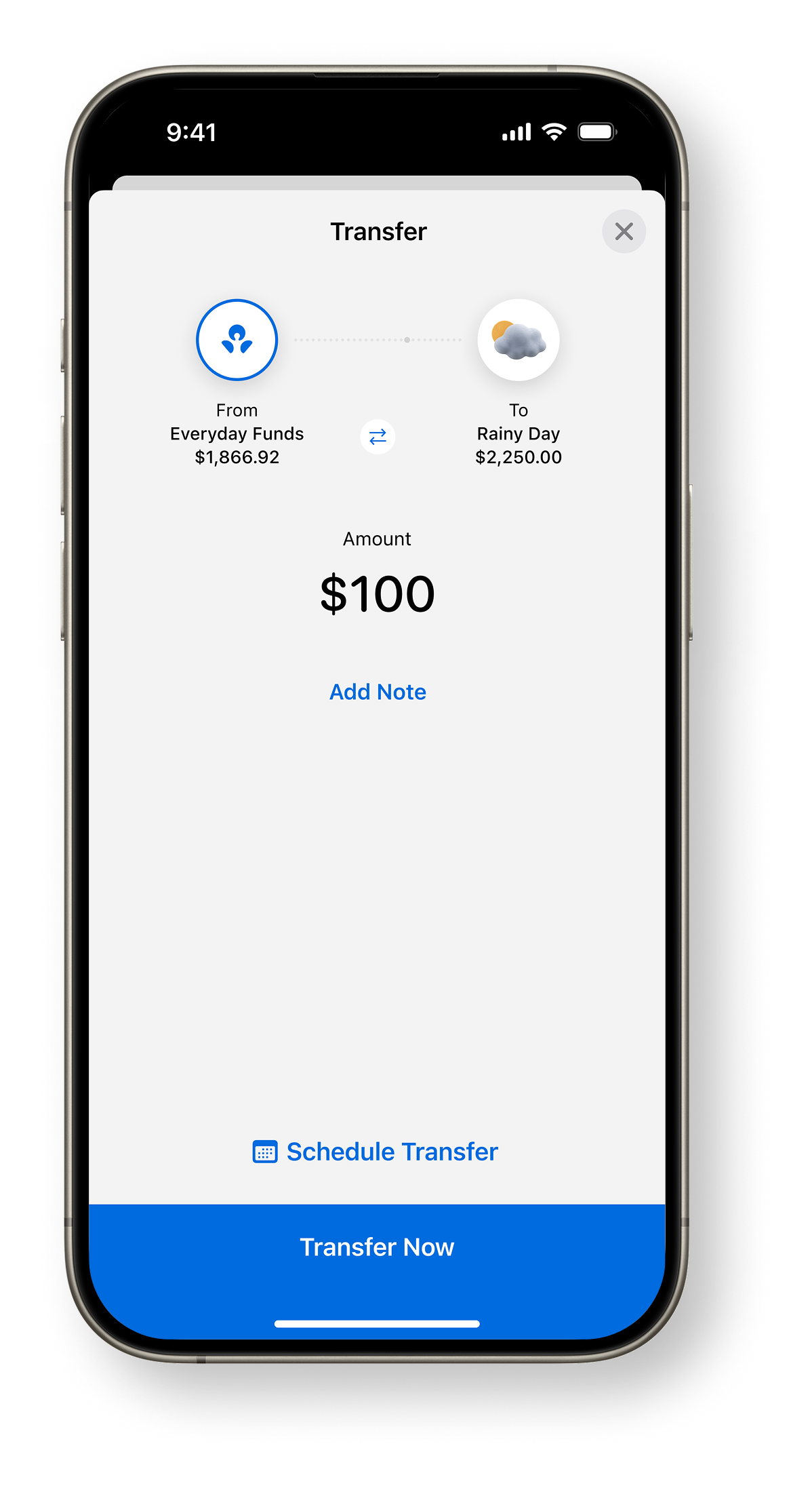
As one of two principal product designers appointed pre-inception, our initial task was to prototype and validate early CX concepts, accelerating launch readiness by six months.
I was critical in shaping the product vision, mission, and strategy, and went on to build and lead a high-performing team of designers, writers, and design system specialists.
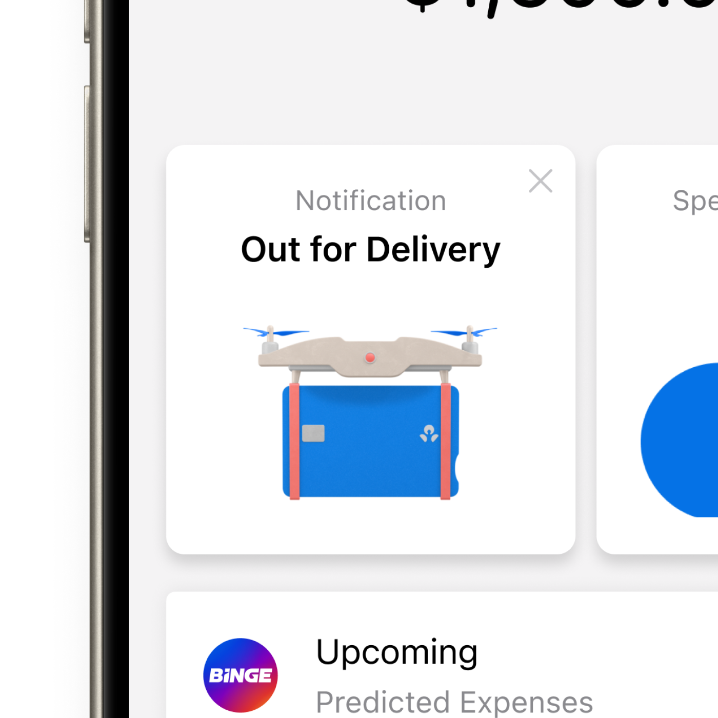
Together, we defined and delivered a modern brand and product, fit for ANZ’s future, and in the process delivered Australia’s fastest-growing banking app.
Financial wellbeing
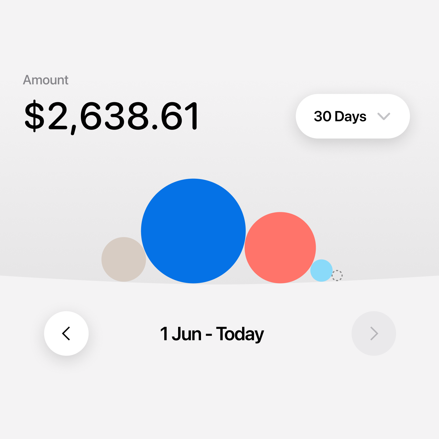
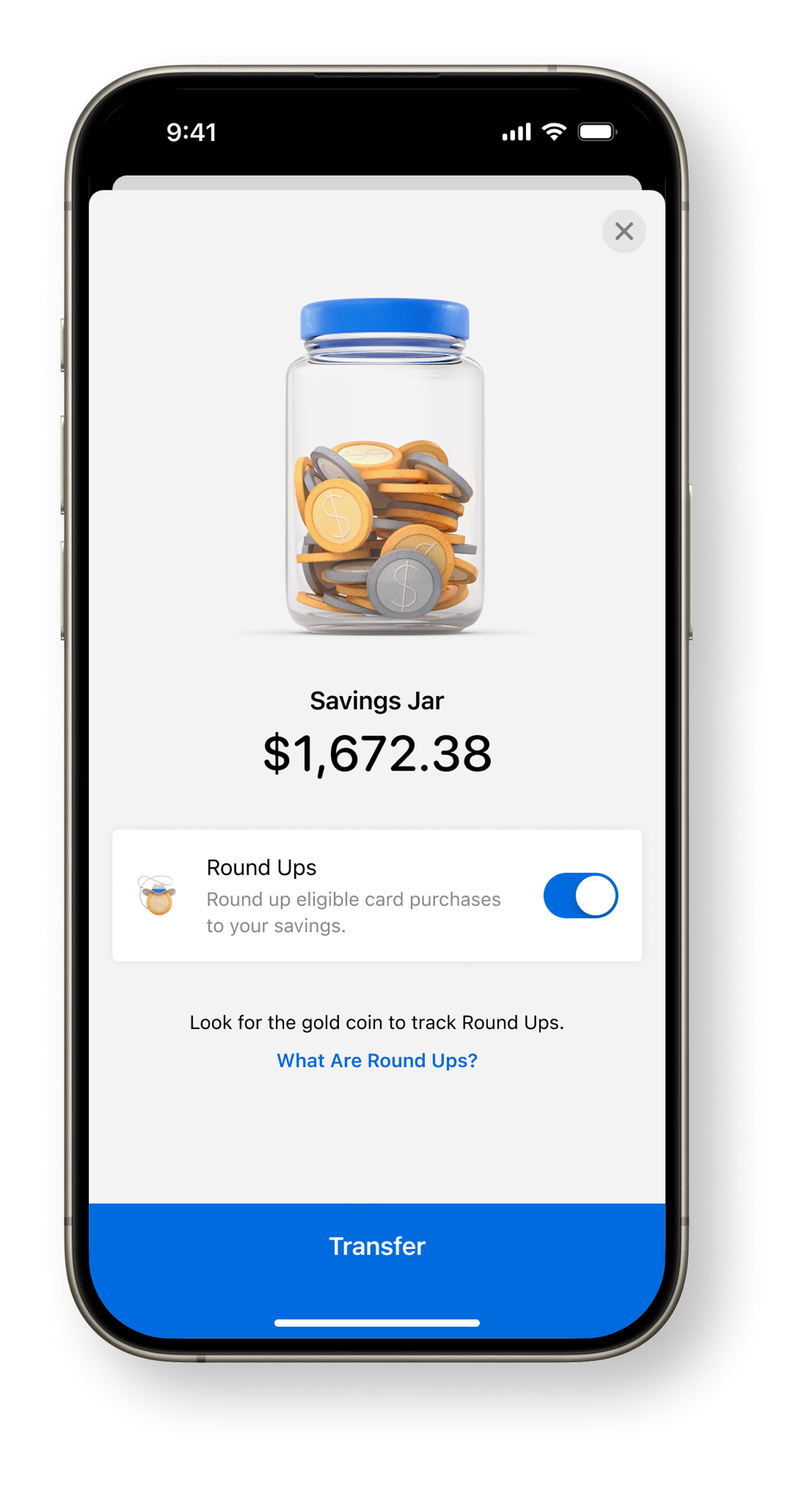
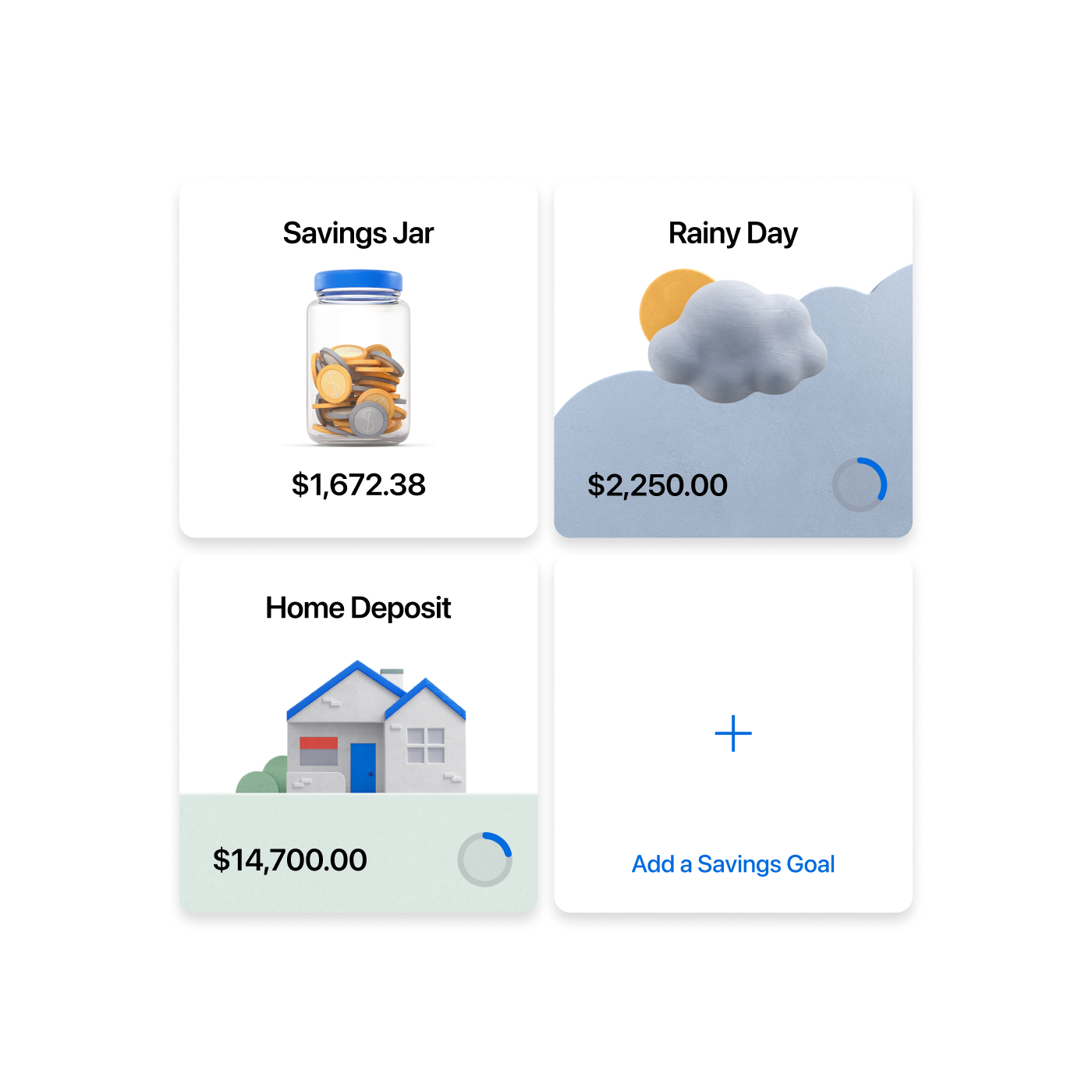
Long before ANZ Plus, an early concept formed the first pitch to convince our executive team that financial wellbeing could be something we hang our hat on as an organisation.
Born from the work in Grow — aimed at making wealth a concept people could grasp — the financial wellbeing principles formed a foundation for us to lean on as we designed the ANZ App and, later, ANZ Plus.
Project info
- Role: Principal Designer / Design Director
- Responsibilities & Deliverables: Vision & Concept, Brand & Creative Direction, UI / UX Direction, Prototyping, Research & Validation, Team Recruitment, Team Leadership, Process Optimisation
- Credits: ANZ Plus Creative / 3D & Motion · Garett Mayow, Creative Director · Emily Pritchard, Art Director · Nick Weller, Motion Director · Jonathan Lochhead, Head of UX & Principal Designer · Sam Berriman, Head of Design Systems · Duncan Ward, Head of Content · Adrian Maciburko, Head of Design
- Visit: anz.com/plus
- Download: App Store · Google Play
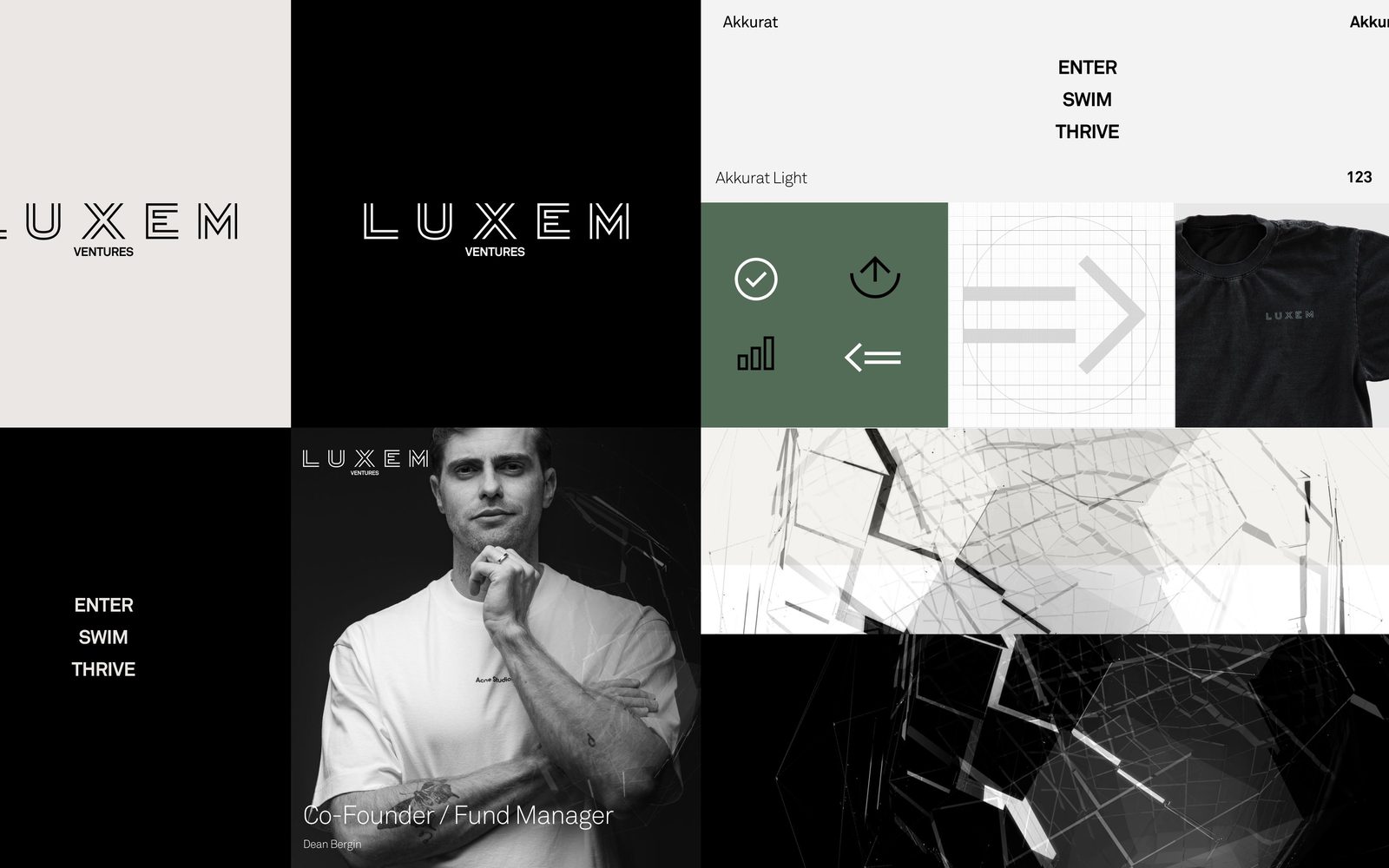
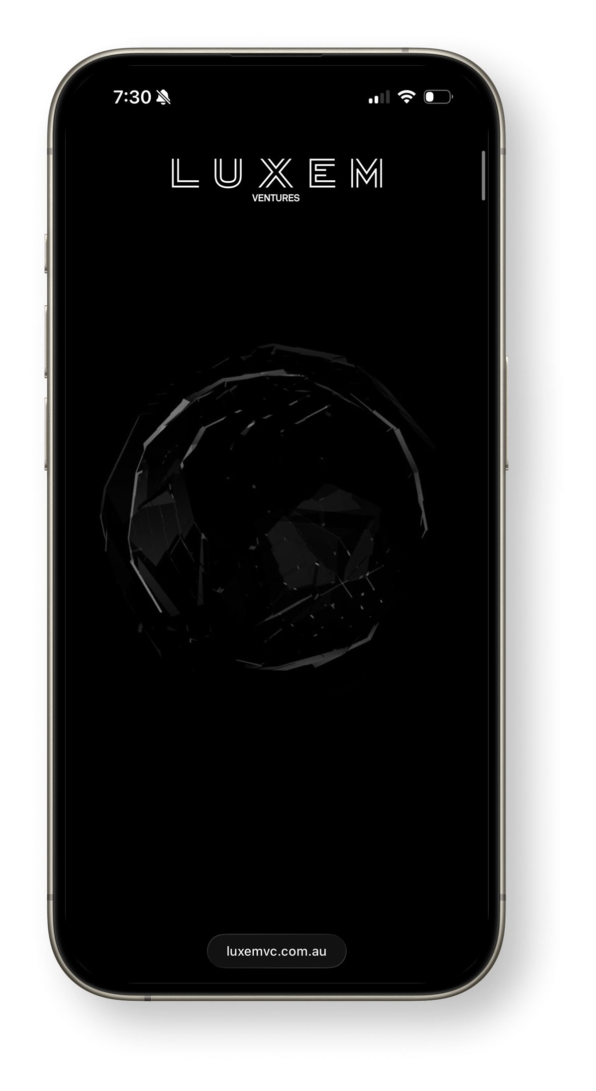
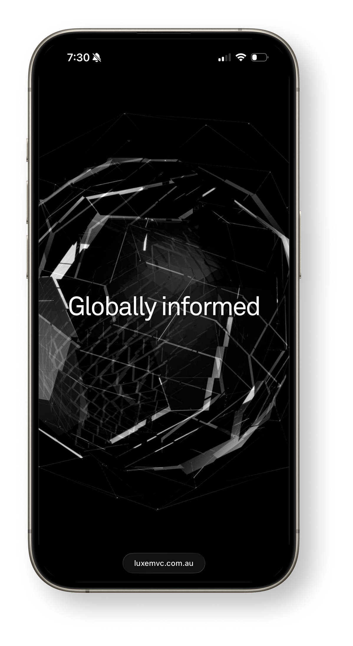
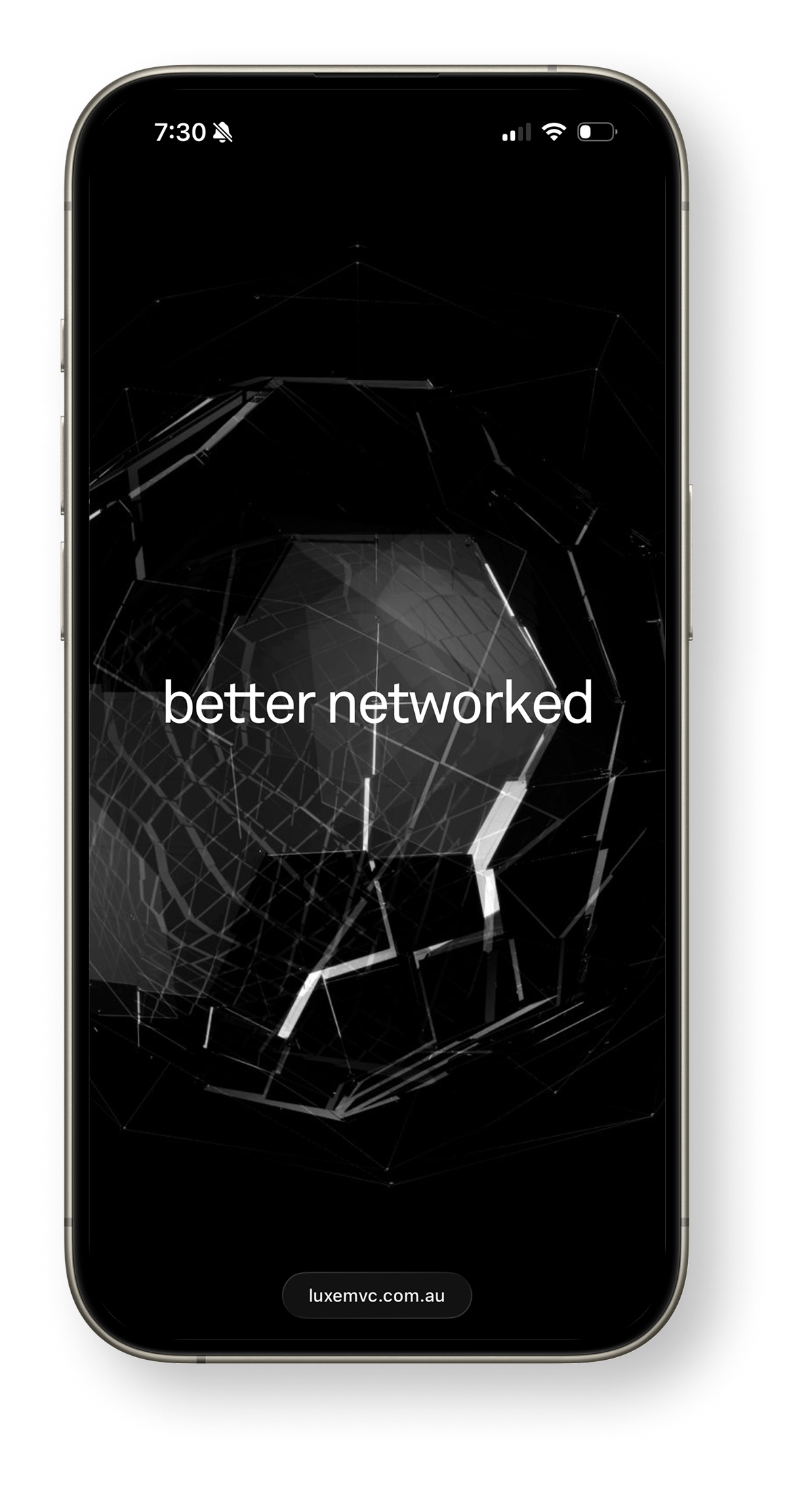
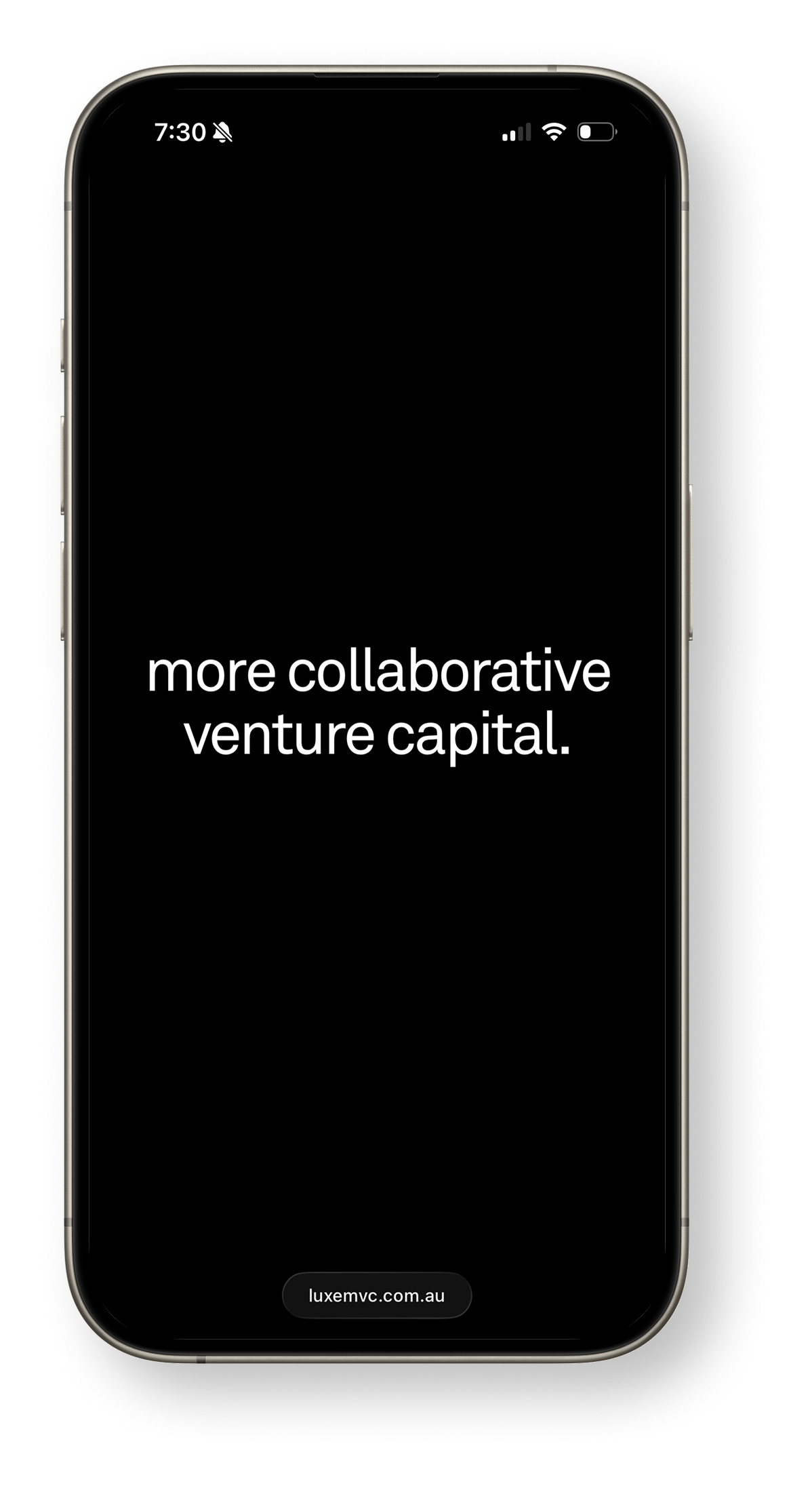
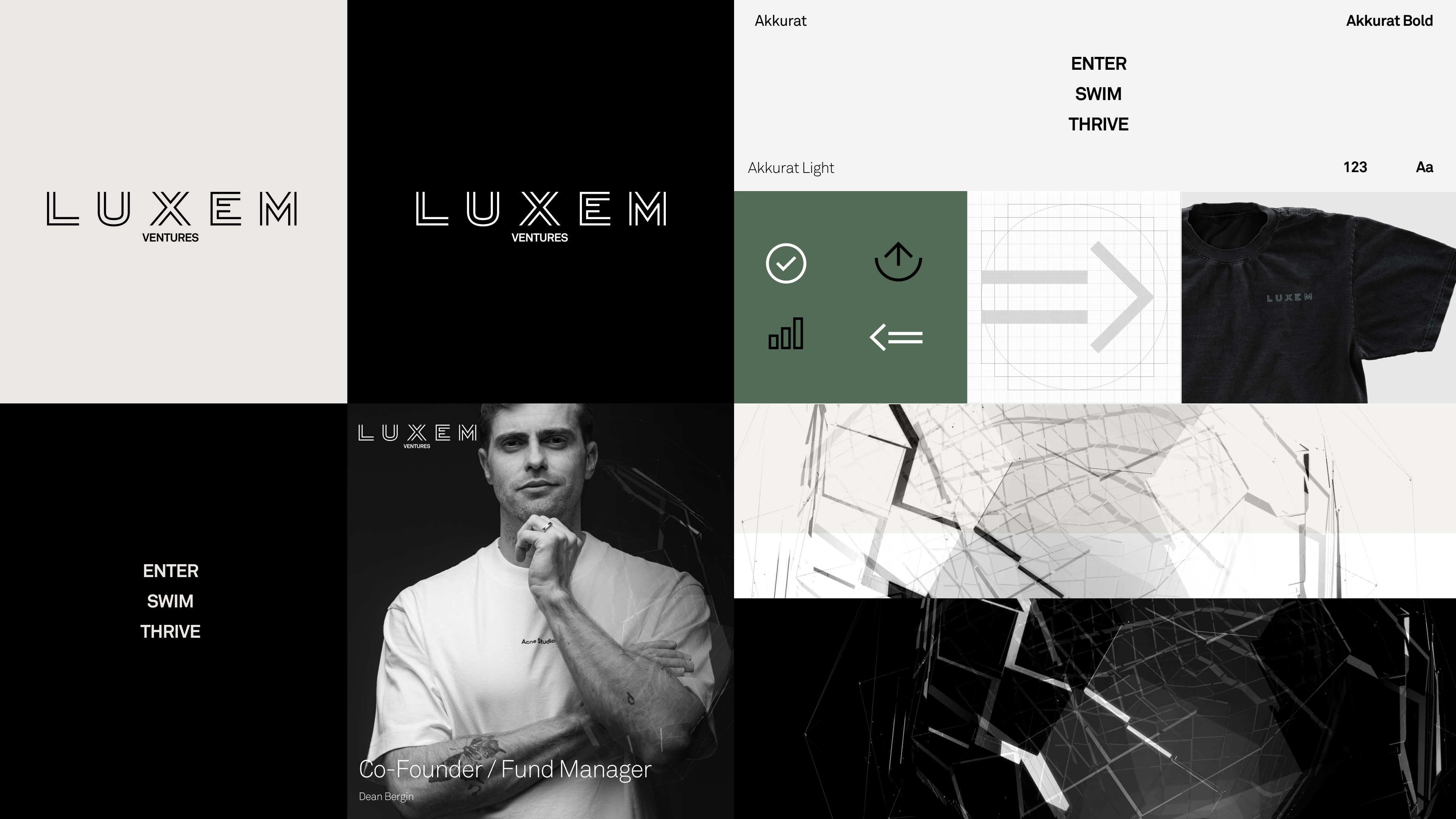
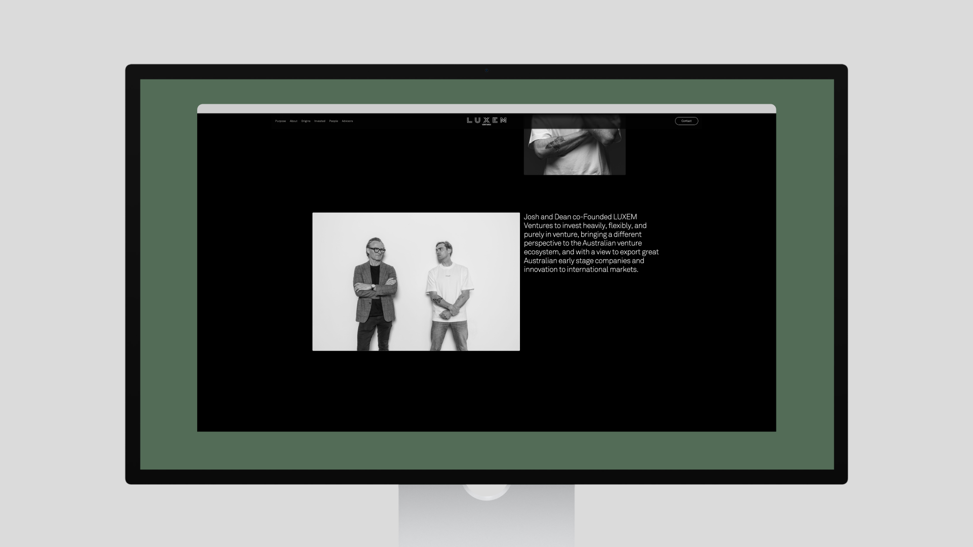
LUXEM Ventures engaged me to expand their brand identity beyond a basic logo, colour palette, and typeface.
Our goal was to create a cohesive visual and digital presence that reflected their core focus: investing in promising seed and startup ventures. Drawing on themes of connectivity, innovation, and digital networks, we extended the brand across multiple touch points to reflect LUXEM Ventures’ forward-thinking investment philosophy.
Project info
- Role: Principal Designer / Design Director
- Responsibilities / Deliverables: Brand & Creative Direction, UI / UX Direction, Prototyping, 3D/2D Animation, Interaction Design & Development
- Credits: Jayden Zernich / Original Brand Definition; Woodrow Wilson / Photography
- Visit: luxemvc.com.au →
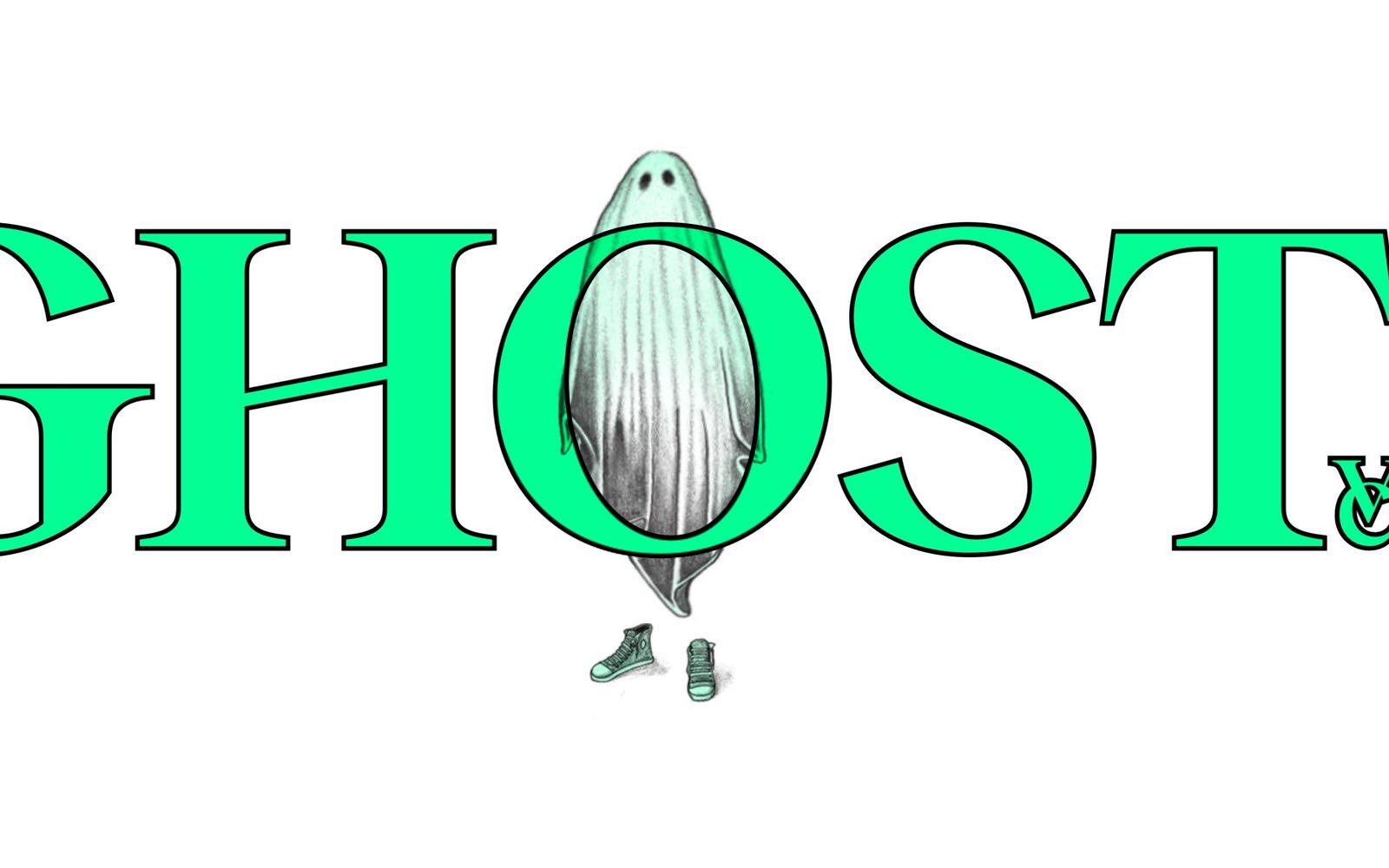
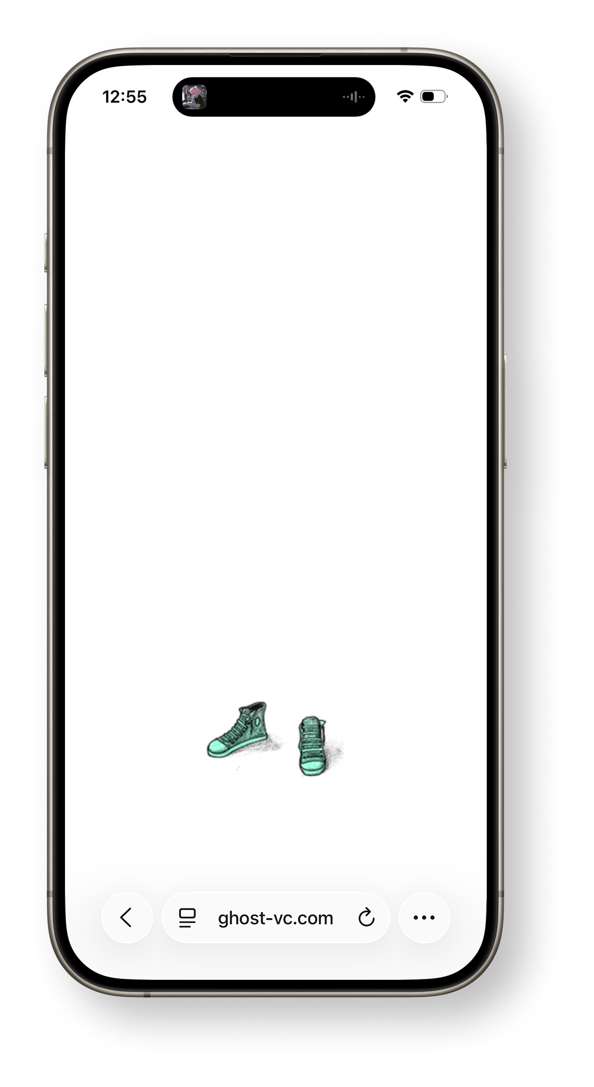
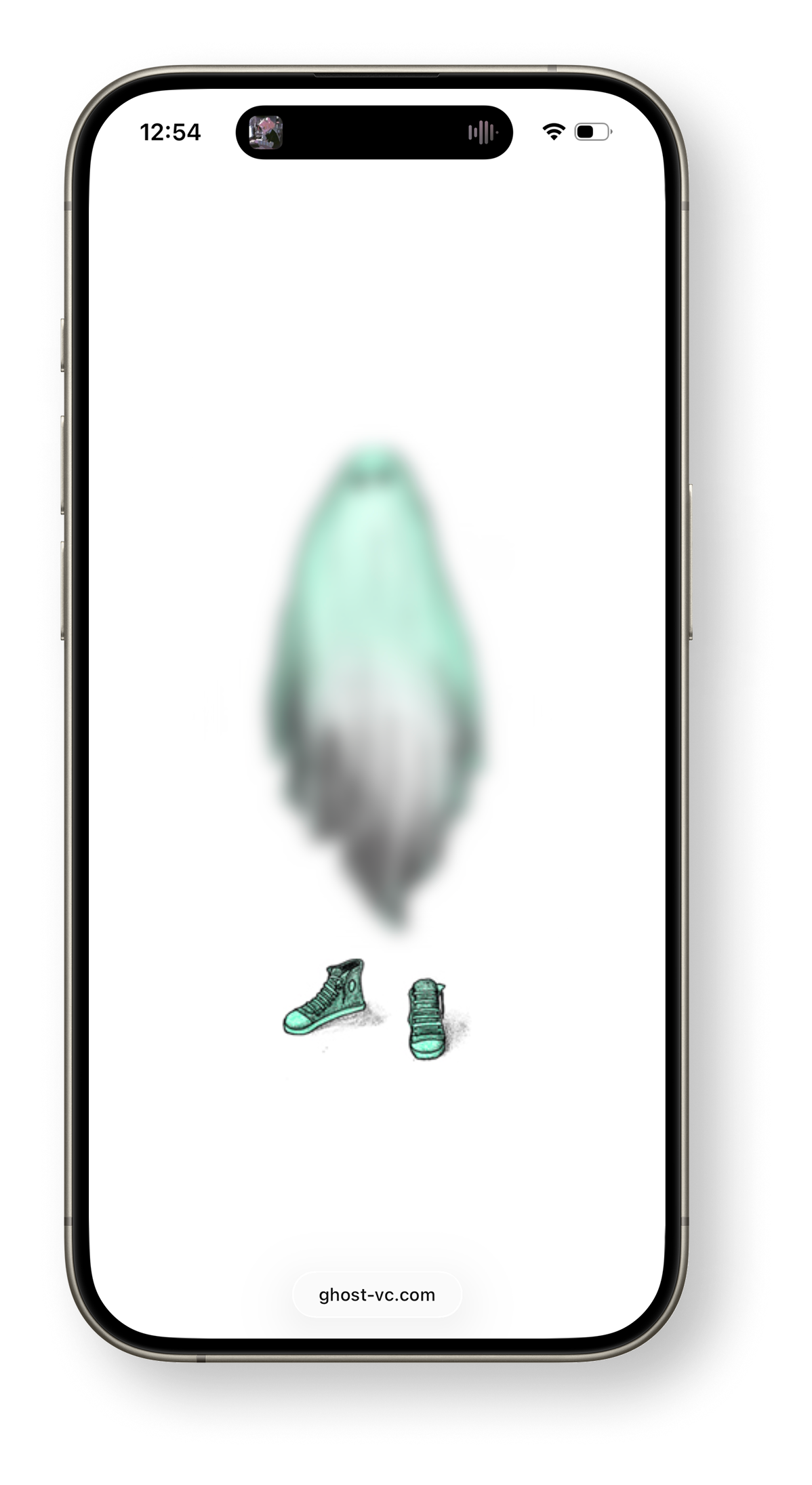
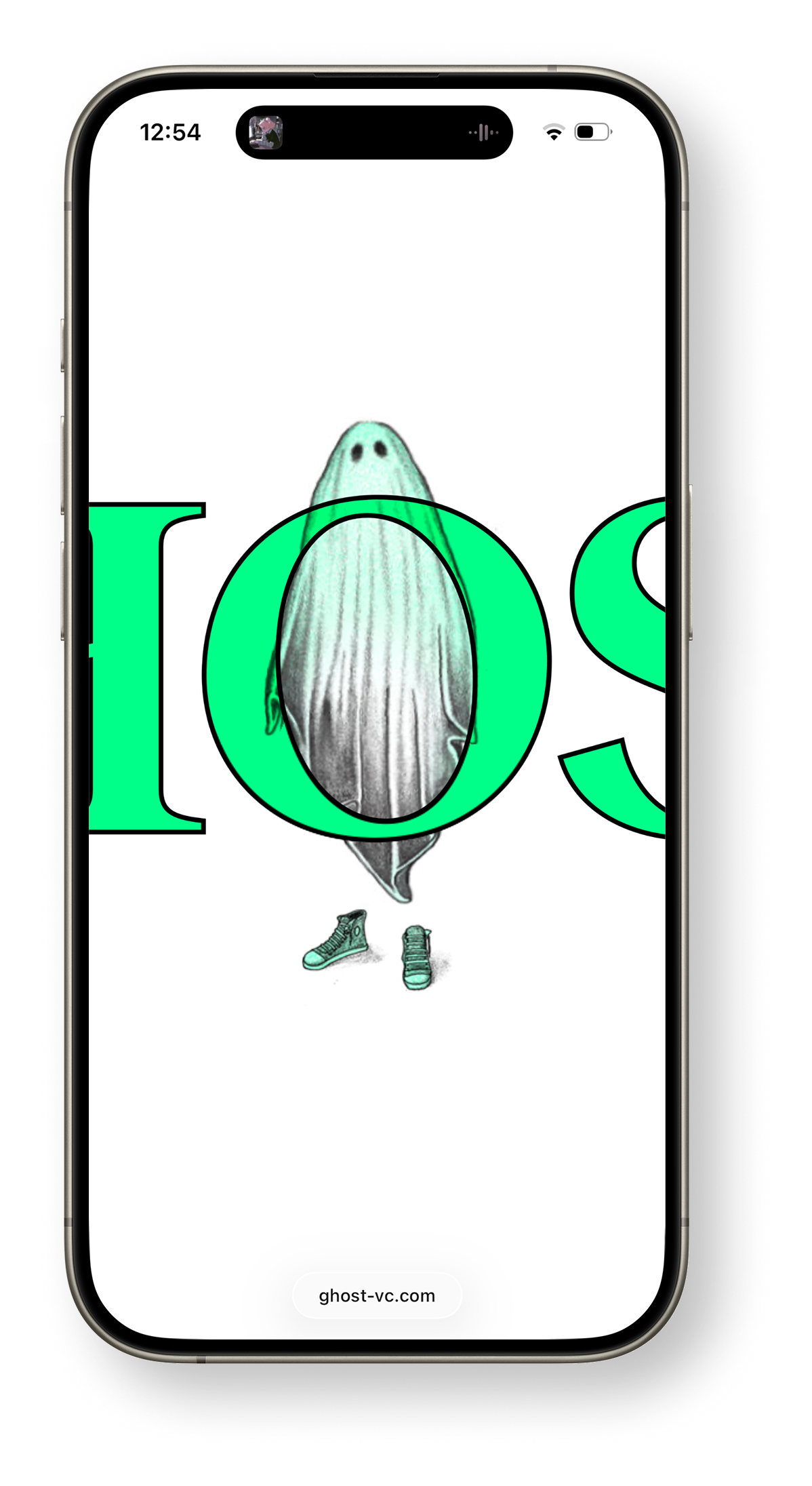
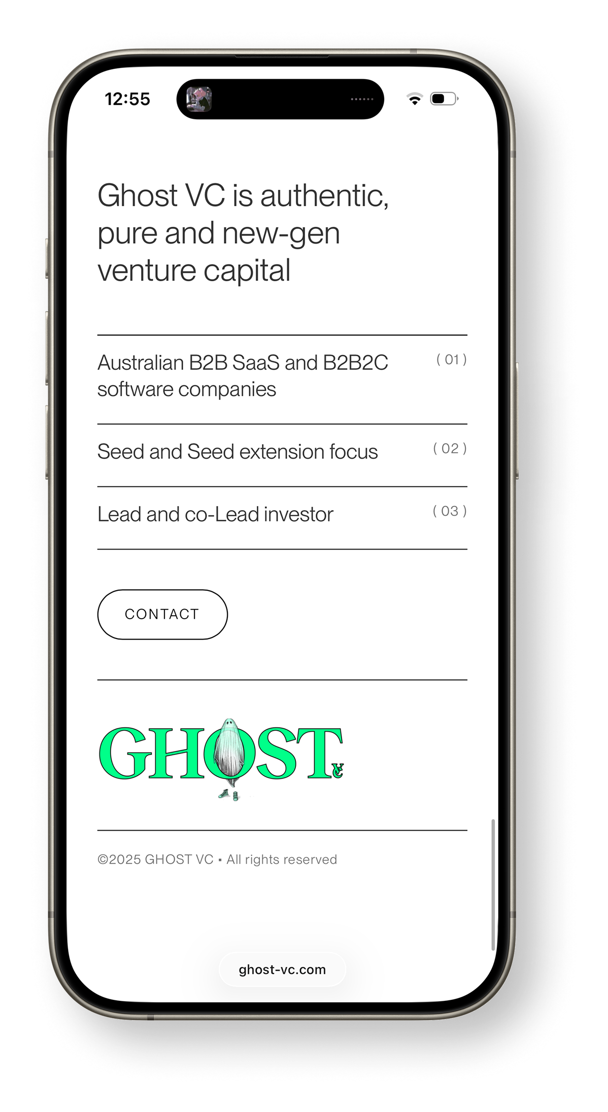
Ghost VC needed an identity with presence — something that could feel quiet and elusive while still carrying the confidence of a venture brand. The work spanned creative direction, illustration, 2D animation, and the design and build of the website itself.
The identity centres on an illustrated ghost and an animated logo that brings the character to life, paired with a system that carries across screens and interactions.
You can explore the full project at ghost-vc.com.
Project info
- Role: Designer — Creative Direction, Illustration, Interaction Design & Development, 2D Animation
- Credits: The Ghost
- Visit: ghost-vc.com
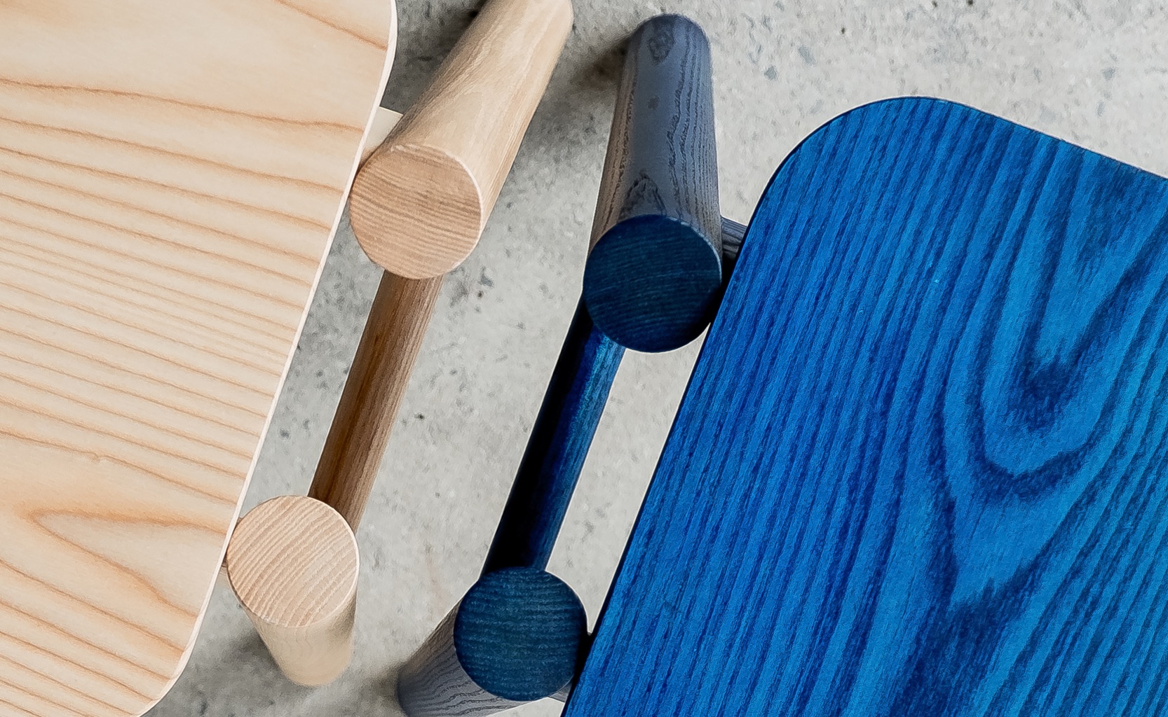
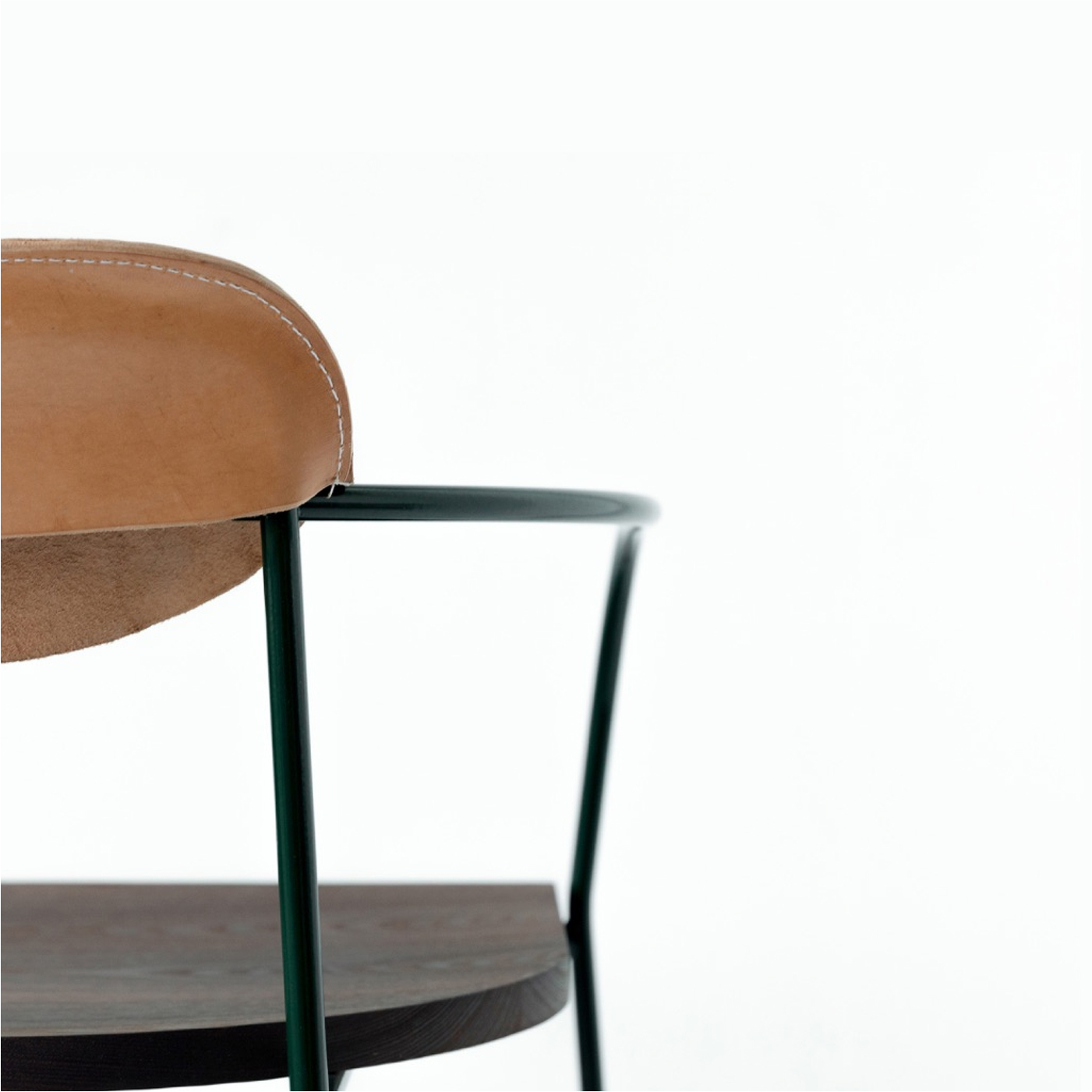
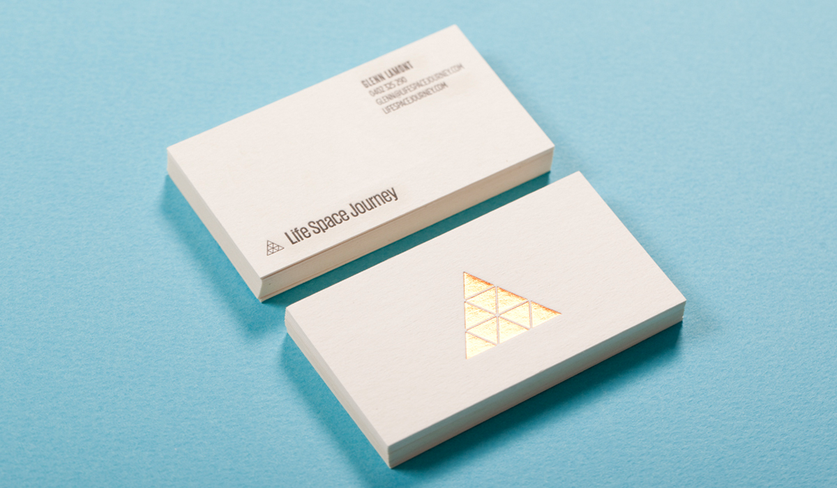
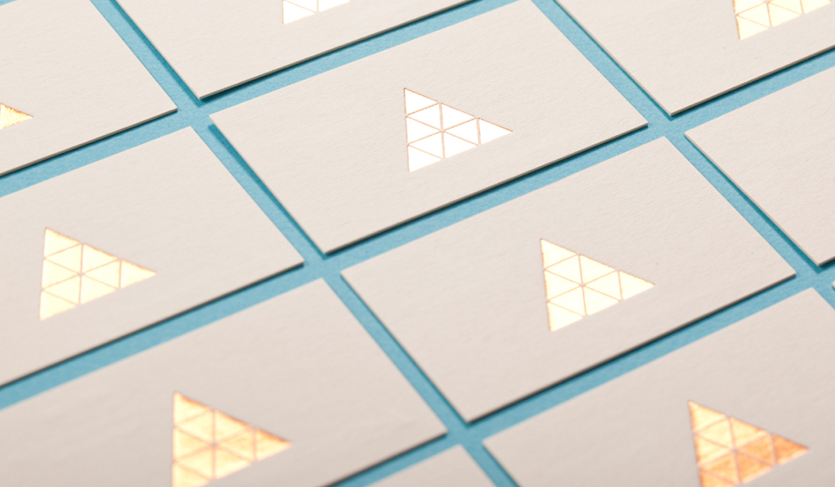
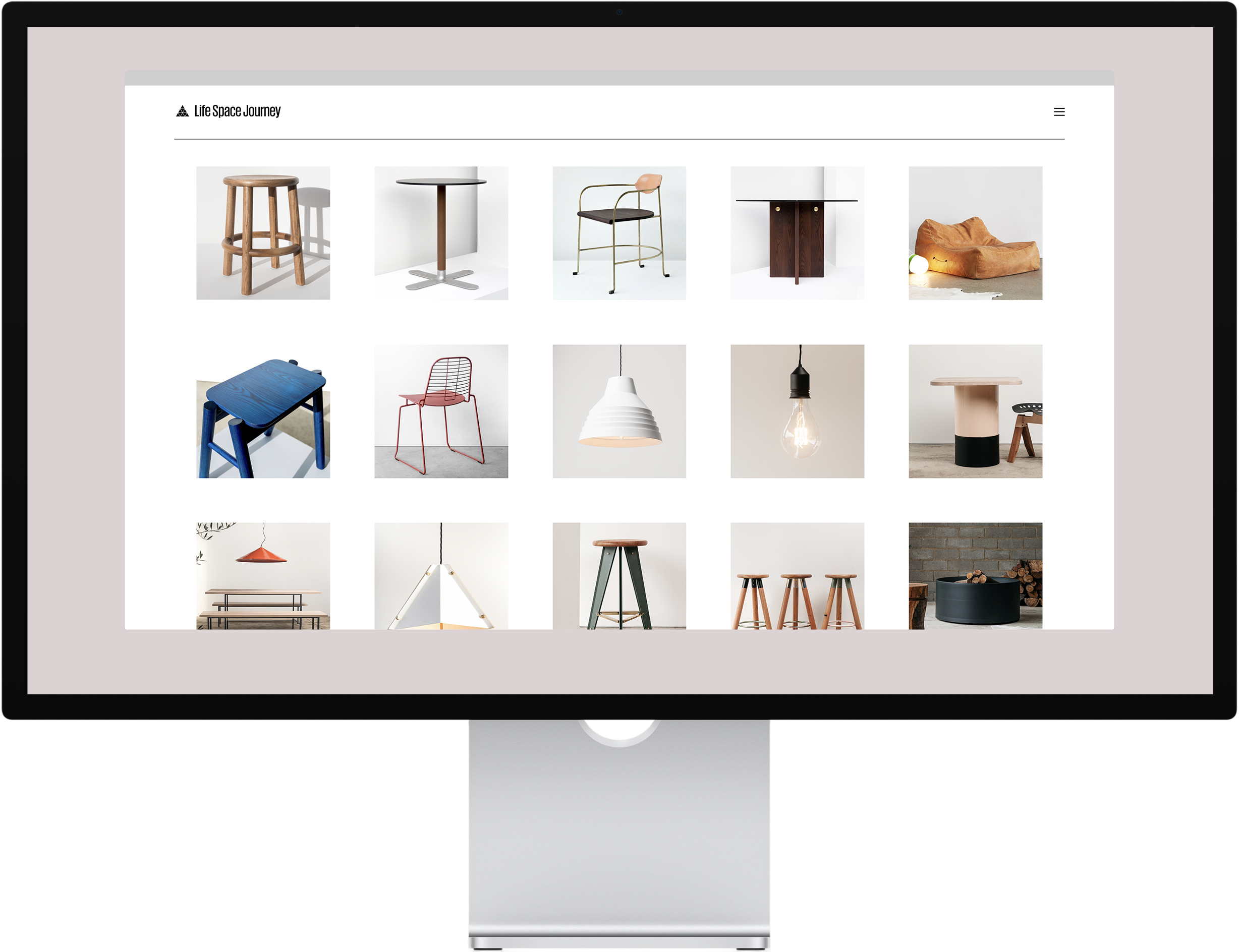
Brothers Justin and Glenn Lamont create some of the most unique and beautiful objects for the home, with a friendly, human approach to manufacturing.
Taking inspiration from roots in rural Australia, their vision and style is refined and luxurious, yet approachable and relaxed.
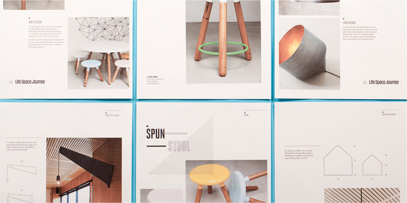
Here, my long time collaborator Jayden Zernich and I created digital and brand assets to showcase and complement their unique approach.
Project info
- Role: Design / Code / Creative Direction
- Responsibilities / Deliverables: Brand & Creative Direction; UI/UX Direction; HTML/JS/CSS
- Credits: Amy Woodward — Product Photography; Jayden Zernich — Co-Direction
- Visit: lifespacejourney.com →
A collaborative art project between father and son exploring gene mutation, processing a life altered, and the unexpected blessings of disability.
During a hospital visit with my son, I watched him create art with no consequence — no audience, no goal, just making. I had become despondent that my professional practice was beginning to feel stale, and seeking a new outlet, I turned to 3D. It was a way to connect with my son and his disability on his terms.
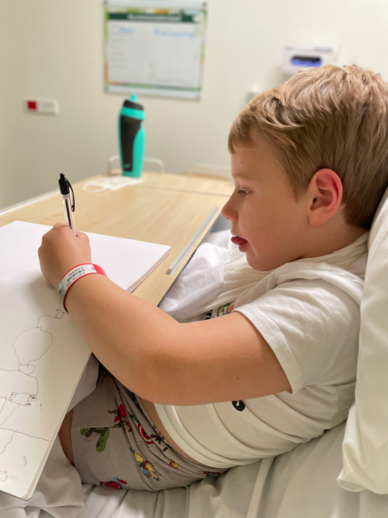
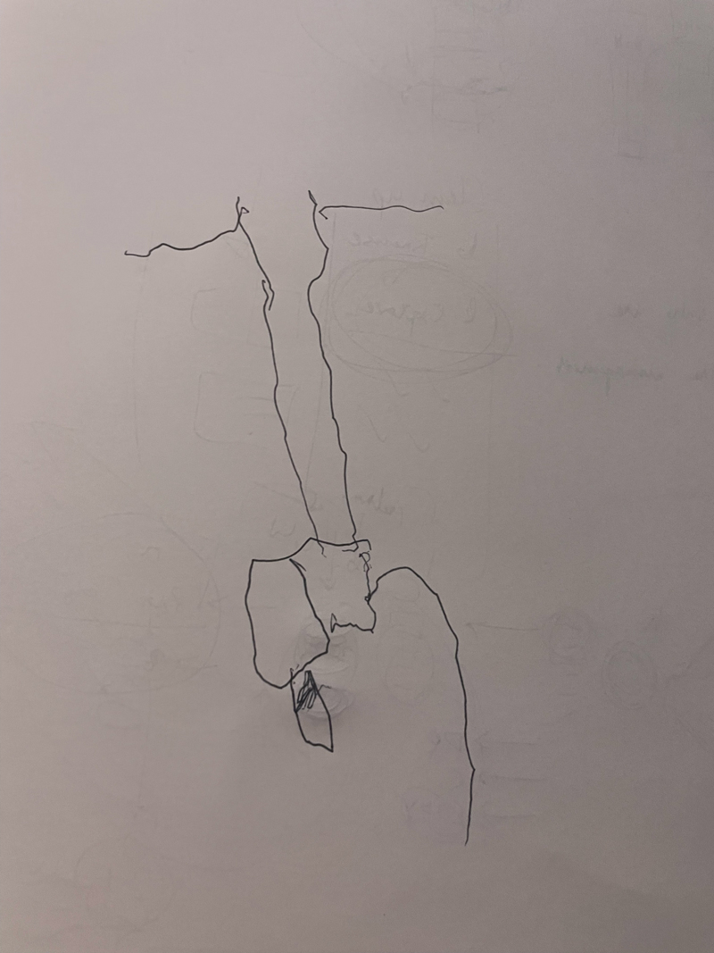
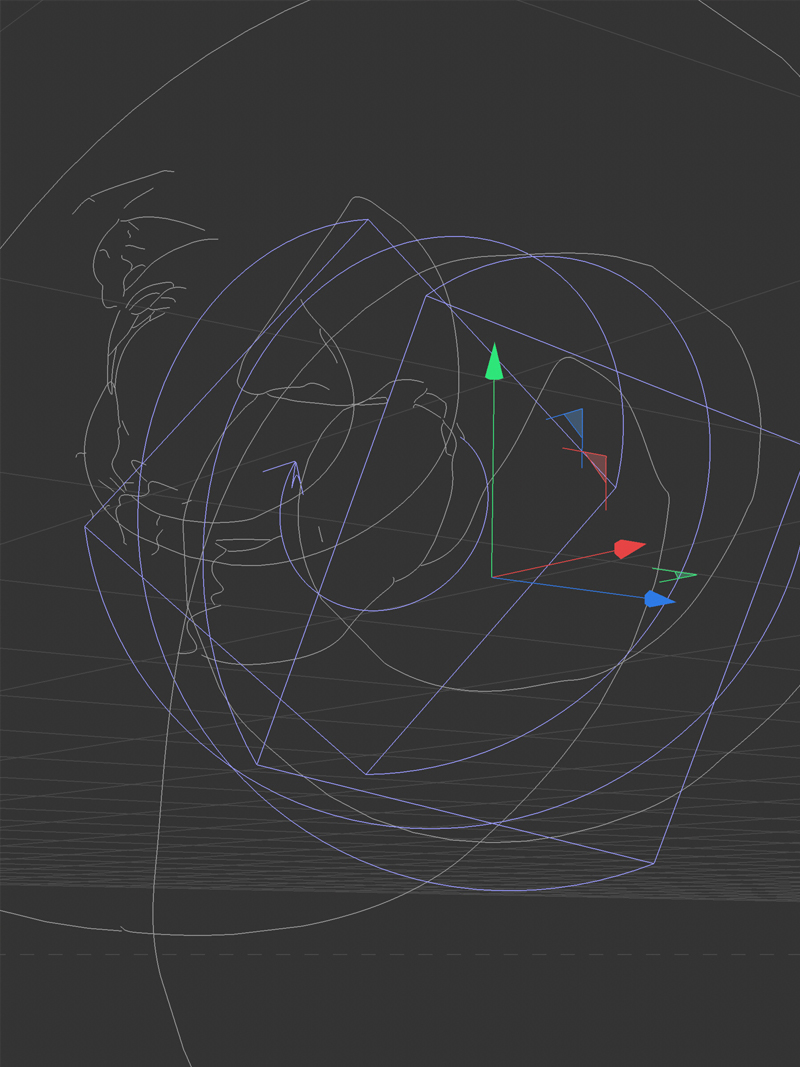
Taking his naive sketches and approach, I turned them into splines and explored dynamic texturing and lighting in Redshift — a process I hadn’t tried before. The result: my own naive abstractions. We made art together and explored NFTs in the process.
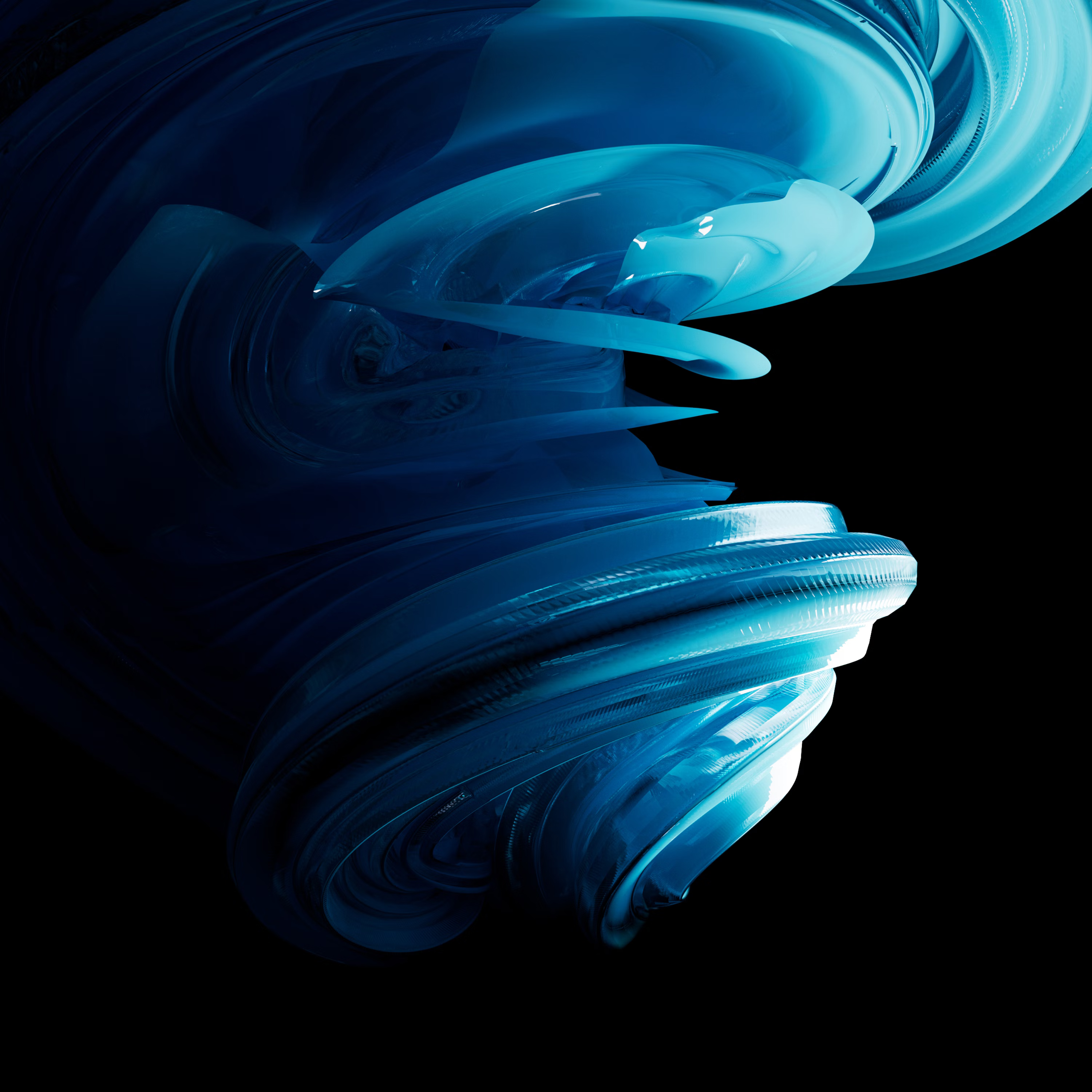
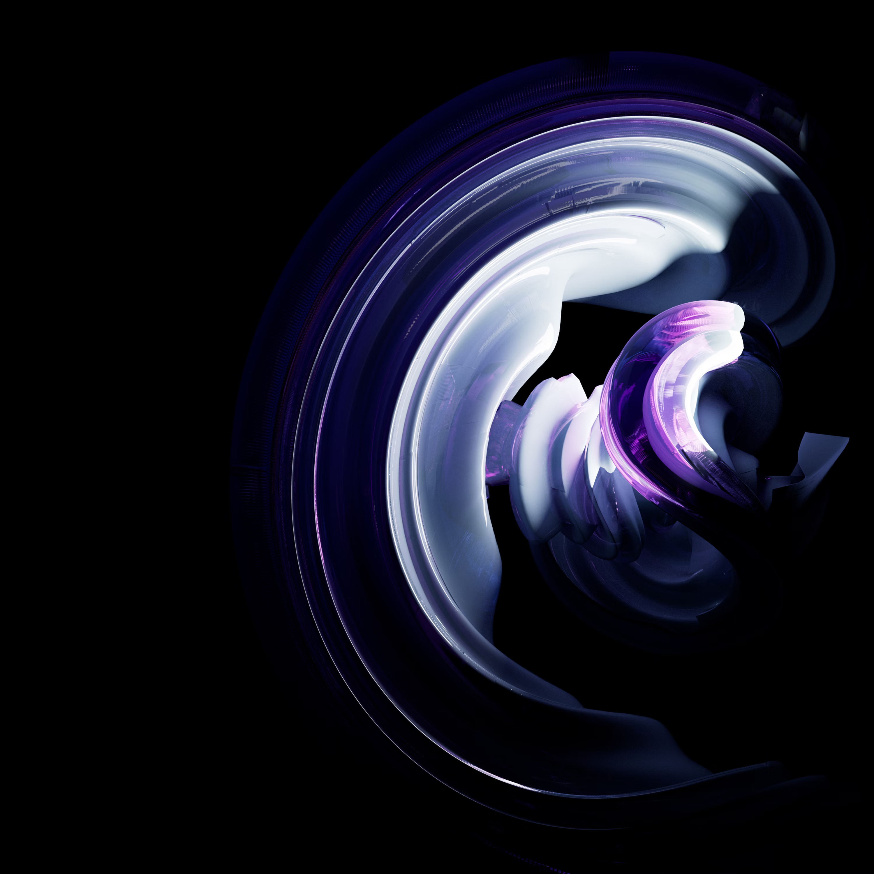
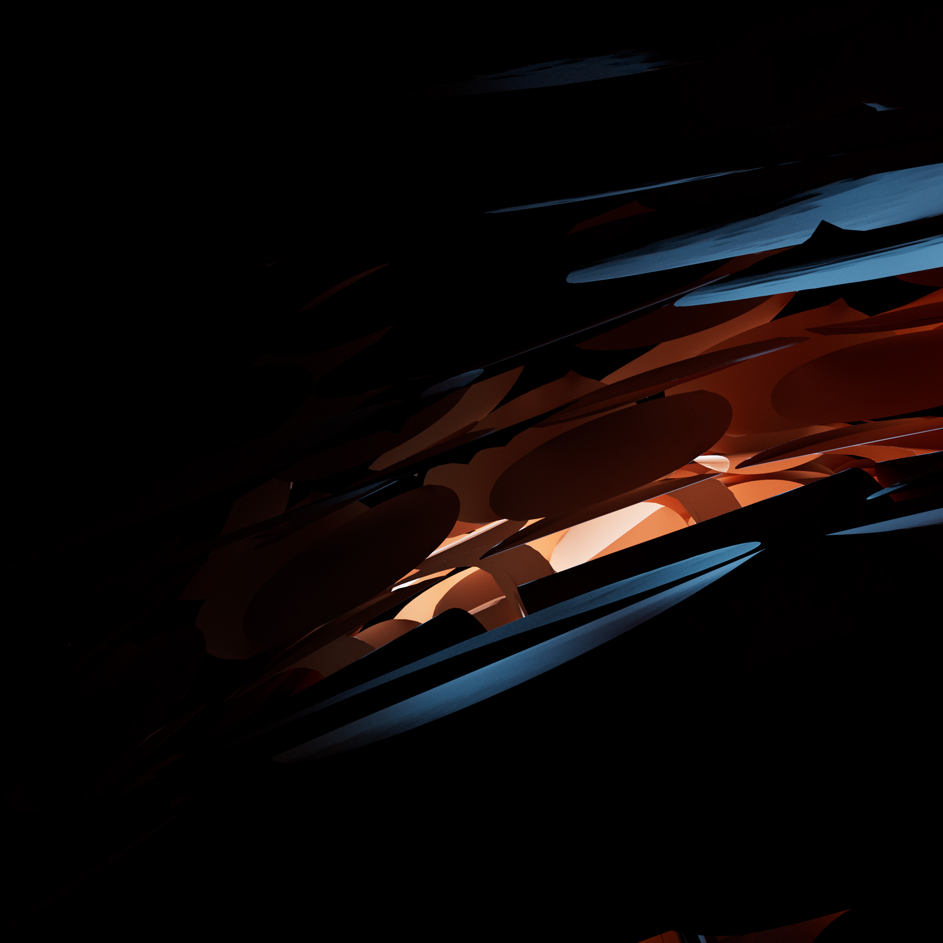
The collection lives on foundation.app.
Project info
- Role: Artist / Father
- Responsibilities / Deliverables: Creative Direction, 3D Modelling, Redshift
- Credits: Charlie Scholten — Original Sketches
- Visit: foundation.app